Why Inter played with a different logo on its chest
In the Champions League match against Salzburg, the symbol of Paramount+ changed.
Sports
November 9th, 2023
November 9th, 2023
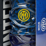
Inter lined up for last night's Champions League match against Red Bull Salzburg in the white away kit with the black and blue diagonal stripes that has already been worn in various away matches this season. In the centre of the chest, however, the logo of main sponsor Paramount+ has been changed, adding the iconic mountain design that has always characterised the production company. The oldest logo from the golden era of Hollywood, which has changed over the years but has always appeared alongside the Paramount name, has thus also been used on Inter's away jersey, where previously only the lettering format could be seen.
UEFA rules stipulate that each team participating in European competitions may only use one logo for its main sponsor. So after Inter had already appeared in the last three games with the full logo on the home and third shirts, the change of sponsor was inevitable when it had to wear the away kit. This change did not go unnoticed, as the horizontal text-only logo better suited the design of the kit, which had been designed by Nike on the assumption that the sponsor would be Digitalbits - a deal that was later cancelled after a payment default.