The best eight Canadian Premier League jerseys
Between home kits and away kits, Macron unveiled the aesthetics of the Canadian league
Sports
April 12th, 2023
April 12th, 2023
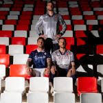
Overseas football is no longer a novelty. And while the MLS has managed to carve out a prominent space in the crowded US sports scene in recent years, the Canadian Premier League is also taking its first steps just north of the border. After qualifying for the last World Cup, the Canadian movement also wants to certify its growth through its home league, which currently comprises eight clubs. As in the other North American leagues, the jerseys are all entrusted to a single supplier, in this case the Bologna-based Macron, and are licensed to experiment as is impossible in Europe. The results are both fresh and surprising, and we bet they will win over the most original jersey collectors.
Pacific FC
It starts with Pacific FC, a team from Victoria, capital of the province of British Columbia, which for this season has opted for two jerseys with the same design but obviously in different colours, so as not to have any problems on the road. And it is precisely the away kit that stands out for its colours as well as its references to ocean waves and the surfing, camping and paddle activities that make this area of British Columbia unique. All these elements come together in a light teal sublimated pattern that echoes the colour of the ocean waves, while the sleeve edging and collar details are a reference to the sandy beaches.
Cavalry FC
Moving on to another away kit, Cavalry FC's total black kit inspired by the natural elements that characterise Alberta. Breaking up the black is a white lightning bolt on the front of the jersey, representing the night sky, while the red and green detailing on the collar and sleeve border are a reference to the colours of the mountains. Finally, as we have often seen in European leagues, on the away jersey, Macron wanted to use the club's secondary logo, sublimated in green, which also appears on the back.
Vancouver FC
For the team that undoubtedly took inspiration from Palermo and Venice to design its logo, the best jersey is definitely the home one. A tribute to the entire Metro Vancouver Regional District, the names of the 53 cities and municipalities that make up the Greater Vancouver area are in fact repeated all over the front of the jersey, creating an embossed motif that expresses the strong sense of belonging to the territory and community.
Valour FC
For the team from the city of Winnipeg, the capital and most populous city in the Canadian province of Manitoba, Macron has created a home kit that unites city and club, repurposing an old trend that was also passed down from Serie A until a few seasons ago. The new Valour FC primary kit features a predominantly maroon jersey with hints of gold on the sleeves and collar, with a subtle sublimated design of Winnipeg streets.
Forge FC
Another kit worth mentioning is that of Forge FC, which opted for an all-orange jersey for 2023 to convey the feeling of unity. The jersey features a sublimated motif showing the Hamilton city flag chain, representing the city's six communities. The 2022 Canadian Premier League champions are called upon for a new confirmation and will do so with a jersey that always takes inspiration from the city.
York United FC
York United comes with a shirt and sponsor that have made history in Europe together with Liverpool. The rest of the design of the York United 2023 home kit features the colour white, which includes the club's classic tones of green, blue and gold. Adding to the appeal is the sublimated band on the front that represents the club's history, linking past and present. The kit features a subtle embossed design on the sleeves, inspired by one of Toronto's most famous neighbourhoods.
Atlético Ottawa
Hard to choose between home and away but we go with the latter, especially for its shade, a tribute to the harsh climate of Ottawa, one of the coldest capital cities in the world. A sublimated motif simulating an icy surface is repeated all over the jersey, unlike the sleeve borders and the collar where there are details in navy blue.
HFX Wanderers FC
For the team of the city of Halifax, one of the regional municipalities in eastern Canada, the choice instead fell on the away kit. Not because aesthetically one is better than the other but because of its very important message that is in fact the pattern of the jersey. The message 'Together from aways' is repeated in horizontal loops, while the rainbow motif on the edge of the sleeves and collar reinforces the message of unity and social inclusion.