The best and worst official websites of Serie A clubs
Sports
November 11th, 2021
November 11th, 2021
A website in 2021 is something between a digital business card and and an old relic surpassed by social media. Above all the soccer clubs sites are a gateway for tickets and merch but also they can give us a snapshot of the society’s dedication on creating and defining the team’s aesthetic.
If some teams like Juventus and Milan have invested on their rebrand to compete on the international level and Venezia found in the overstylization a gateway to become relevant, many others still consider the on-line presence an afterthought to be done in the most simple and cheaper way possible. A gap that sadly influenced the Serie A as a product in Italy and beyond national borders, preventing it from becoming more recognizable and exportable like the Premier League.
So we have ranked the three best and the three worst Lega Serie A official sites.
The Best
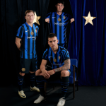
Juventus F.C.

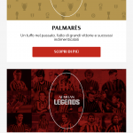
Juventus has never hidden its ambition to be recognizable outside the pitch, as the Allianz Stadium and the Palace collaboration prove, and the official site is a continuation of the branding. Is clear and responsive, opening up with a full screen video with highlights from the male and female first squad, and scroll down to the news and calendar sections. For the tickets you have to go down a little bit more or use the vertical menu on the right, where you can also find roster info and a link for JuventusTv.
Venezia F.C.


Venezia is one of the best teams regarding branding in Europe so it is not a surprise that its website is on the better part of our chart. They choose a minimal approach, with pictures of the city and the team dominating the landing page coherently with the club’s visual style. The menu is small and contained in three stripes with the club social colours, but it opens up for any information you need. The Venezia website is a polish, clear and beautiful one, in line with its aesthetic. Why be a football team or a fashion brand when you can be both?
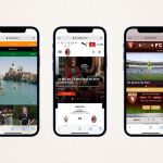
A.C. Milan


Through its website Milan is carrying on the restyling asked by the new ownership, elegant and clean without excesses. It opens with a horizontal carousel on the more important news, then presents the Serie A calendar and ranks, where you can find Milan in first position, and gradually videos and photos of the team. You can also buy the new Puma kits using the menu or the banner. All the informations are easy to get and the whole website is comfortable and tailor-made like a Stefano Pioli suit.
The Worst
Torino F.C.


When you open the Torino website you go down a rabbit hole through internet paleohistory, when everything was squared and so small you need a magnifying glass. It’s hard to explain why they choose to not use half of the screen or why it is full of grey boxes with the club’s logo but those are not the right answer to Torino's struggling years. Even more are the proof of their lack of interest and downsizing.
S.S. Lazio
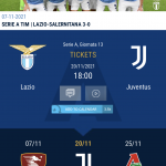

Under Claudio Lotito's ownership Lazio reached a lot of goals thanks to a wary and smart asset management. But was not able to install a new and more prestigious image of the club, and the official website suffers from a lack of ambition. Is small and contained in the head menu, where you can find all the basic information, and offers only a small carousel, Serie A ranks and calendar, a sad social box and the link to the YouTube channel. But the photos and font choices are sloppy and convey little awareness of their brand, a big no for a club with international aspirations.
Cagliari Calcio


Cagliari’s website suffers from the chronic lack of innovation and vision in Italian soccer. Is a fungible website, where a fan can find the information he needs or buy an electric push scooter with the club’s logo. But it is a clear sign of a team's ambitions and its disregard on branding and storytelling precisely when building a credible image is key in soccer identity nowadays.