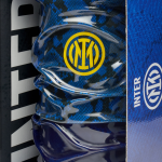
Inter have officially a new logo
The Nerazzurri focus on minimalist design and brighter colors
Sports
March 30th, 2021
March 30th, 2021
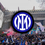
After months of waiting, Inter have revealed their new crest confirming the rumors of the last few weeks. Exactly 74 days have passed since the Nerazzurri announced the rebranding and 2021 is closing an era that involves both the logo and the jersey sponsor. Inter try to explore the dimension that has made Juventus so strong as a brand, with a minimalist design that will not meet the traditionalist taste of the fans but which will be absorbed much more easily by the markets in which Inter sails parallel to the football one.

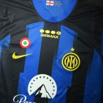
As expected, the shape remains round while the "content" of the logo is distorted, passing from "FCIM" (Football Club Internazionale Milano) to a more concise "IM", ushering in the "Inter Milan" era. During the countdown to today's announcement, the first commercial implication of the new name has already been unveiled. IM becomes "I'M" and in the latest content the Nerazzurri have identified the key words to represent the logo: attitude, tomorrow and timeless, future, inclusion, brave, family, culture, ready and obviously "not for everyone" like the claim of the Nerazzurri media company. The transformation from a football club to a brand seems to have been completed.
The logo update was curated by Mirko Borsche of Bureau Borsche, already author of the rebranding of RIMOWA, Balenciaga and Highsnobiety. The debut of the new logo could come as early as this year, on a controversial fourth shirt that maintains the Memphis design, in line with the first two kits of the current season. It will be a transition that will certainly involve positive opinions and negative opinions, but we just have to give everyone time to internalize a change of pace that has become necessary in modern football.