The Future of Football Jerseys
We asked three graphic designers to imagine the Football jersey of the next 15 years
Sports
November 30th, 2018
November 30th, 2018
It's already passed a month since Tottenham announced the renewal with Nike: the American brand who took over Under Armour in 2017 will continue to dress the Spurs for at least 15 seasons, having signed a record agreement extension, until 2033. If you think about it, it's a far date that made us dream a lot about the evolution of football shirts in this long period. How will the future jerseys be? But above all, what Nike will decide to create for a club that is historically very sober as the London one? We have thought about this with three famous graphic designers that we managed to involve in this 'crazy' project: LOSDEJOS, Rupertgraphic and Matteo Caputo have created for us three shirt concepts each, trying to imagine how the Spurs jersey will change during the next 15 years of relationship with Nike.
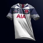
2019/2020 by Matteo Caputo
Inspired by the latest Nike models, it was designed using a particular gradient pattern, typical of the graphic style of the Swoosh displayed again in this season's jerseys using some elements referable to the history of each club's city, re-proposing it in a more moderate key within the historical Tottenham logo (with unique golden details), dusted off last season to give a more traditional and at the same time modern look to the shirt.
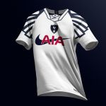
2020/2021 by LOSDEJOS
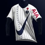
An homage to the retro horizontal stripes but using a baby blue as it happened in the old days, with a special stipple gradient that refers to the late 80s and the crest in the middle of the chest.
2022/2023 by Rupertgraphic
Taking a hint from the 8-bit world, it brings back the letters on the shirt to form the writing Spurs, as happened many years ago on famous Tottenham jersey produced by Umbro. Red base badge as in the club's first years of life and very particular sleeves' design.
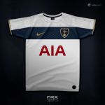
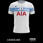
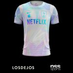
2024/2025 by LOSDEJOS
This design is "wired". Not wired literally, but it's designed with wifi connectivity. In the future, there won't be no "wires", but organic yarns that can conduct electricity, etc.. The connectivity allows for the coaching staff to get real-time stats for performance and also health. The connectivity also allows for certain information to be sent to media and fans, so they keep track of an individual player in a very intimate way. Because information is sensitive, only certain information is allowed. The connectivity also makes it easier for refereeing: whether it be offsides, knowing which player to give a card to, etc.. Because of the tech, the future would make for a collabo between Apple and Nike. (that's the reason of the wifi symbol at bottom right front hem). The iridescence is a reference to old school iMacs when they were translucent and also implies the "wired" aspect. And now that we see the likes of Amazon and Netflix getting into football documentaries, in the future they will be sponsoring more clubs and possibly even owning one.
2025/2026 by Matteo Caputo
It's an imaginary mix between 3 historical and iconic templates created by Nike since the '90s (1994, 2002 and finally the fantastic Total 90), merged into a single concept shirt. The idea stems from the fact that a lot of football fans appreciate the trend towards a return to the vintage line adopted by some brands: a jump into the future without giving up the historical design of the past.
2028/2029 by Rupertgraphic
A clear tribute to the Nike uniforms of the 90s because of the sleeves and the collar, while the sponsor mix is a reference to the 17/18 kit of AS Velasca: the most experts jerseys' collectors have certainly recognized a great resemblance to the epic Borussia Dortmund shirt of the 1994/1995 season.
2029/2030 by Matteo Caputo
Revolutionary but not too much, combining design and fabric engineering, it's a concept devoid of almost any seam, with futuristic technology and innovations. The Swoosh is the main protagonist, unique and unmistakable element throughout the shirt. The color scheme is very unusual for Tottenham, but it is already used in the past, even it was not fully appreciated.

2031/2032 by Rupertgraphic
More than a jersey, a true Nike Lab prototype and a concept of the running world, which intentionally describes a future migration of the elements from their classic positions and a distortion of their weights. Over the shirt, customized long sleeves and face/neck protection are also part of the kit. In addition to the original badge are added some historical symbols such as the monogram, the H red emblem and the repeated design of the vintage cockerel that looks at the current one.
2032/2033 by LOSDEJOS
Depending on how much the consumer pays, the graphics are unlocked so that the consumer has one, two, three or more jerseys in one shirt. Because in the future, the sponsors, colors, graphics etc. will all be animated. Imagine the Swoosh bouncing around the shirt and then returning to its chest position. Sponsors will also change depending on who is looking at the shirt (depending on if the club has the fan data) to target specific demographics. The jersey is sponsored by Alibaba and switches to the Tyrell logo from Blade Runner, as a reference for the Chinese influence in the future and using Blade Runner being the future. A big reason for all shirts in one is environmental, to use less raw materials and help save the environment.