Rethinking the new Juventus logo
Interview with the designer who tried to "complete" new Bianconeri logo


Sports
January 23rd, 2017
January 23rd, 2017
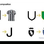
Last week Juventus introduced new logo, that will be on the uniforms of the team from the next year. Realized by Interbrand, the new logo has the finality to tell a new history, a new page of the life of Juventus, more modern and more directed to the market.
The logo however has aroused conflicting reactions in the “juventini” fans, splitted between the trust in the choices of their society, skepticism and complains (sometimes exaggerated). If everybody have understood the intentions of the Juventus with the new logo, in so many have accused the new project of lack of identity, of a link with the city of Turin in primis and with the football in general. On the socials, besides the irony, showed up different ideas of designer who tried to “complete” the logo. We came into the job of Matteo Caputo, young Sicilian designer, who has re-thought the logo. We have ask him some question.
First of all I’d like to ask you: are you a Juventus supporter? Why did you want to complete the logo?
I’m a supporter of the football in general but I’m not a fan of Juventus, but I often look at their games and in those last years I spent some time deepen understanding the Juve history through a careful analysis of what concerns the history of their jerseys and logos. The desire to “complete" the new logo is born from a personal need, to put myself out there and to succeed in understanding, after having effected a careful analysis, if I had the capability to succeeded in giving a more traditional touch and, at the same, an innovative one to the logos introduced few days ago.

The logo was criticized a lot. Which were the most clears “mistakes” (if we can say it) in the work that you tried to correct?
I firmly believe that the official logo has without any doubt an enormous potential, it expresses through the few lines that compose it a strong and definite communicative message. I also understand the criticism, since we are talking of one of the un-usual rebrands in football circle. You speak of "mistakes", nevertheless I prefer to call that "forgetfulness", since I believe that the logo misses of something, a something that represents the affiliation to the city, and above all the affiliation to the football environment. Personally I believe that in the logo must feature elements in a certain sense “traditionalists”, that allow who looks at hit to perfectly understand the meaning. I believe therefore that the principal deficiencies, to me, concerns the overall "form" in which the logo has been drawn: The evolution of the letter J represented to the inside, the contour that recalls the form of the badge and the lack of a symbol that made reference to the city of Turin.
What are the inspirations behind your job?
The inspirations for the realization of mine version of the logo comes from the desire of putting me in the shoes of the company that had the job, to look for - through my knowledges in football and graphic field - to succeed in getting a logo that represents football and at the same time a affirmed brand in the world of the business.
Do you think that the connection between city and team is essential?
I believe that a team of kick first of all represents the city from where it originates. Those are the fundament of football itself. I think that the relationship between team and city must be inseparable. This discourse becomes larger speaking of logos. In the greatest part of the cases any football coat of arms contains at least a reference to the city from which the team originates. Thinking about many logos of famous teams, as for instance in England, teams of the caliber of Manchester United and Manchester City that also having colors and different characteristics have in the respective coats of arms some identical elements. This discourse also englobes Juventus, I think that the logo misses an element that represents the affiliation to the city of Turin that was instead in the old logo.

Which are, in your opinion, the most virtuous examples of rebranding in recent football?
I always sustain that some of the rebrands more succeeded in football circle concern the Manchester City, that has just changed the old and historian logo with a version that remembers a lot the old coats of arms used in years just following the foundation of the team. In this case it is appreciable the fact that coexist football coat of arms and brand in the new logo, since it contains, beginning from the form, the historical elements that visually represent the identity of the club. Same discourse is also worth for the Atletico Madrid, that will adopt a new logo, revisited in very simple but effective way. In Italy I believe that a virtuous rebrand is identified with the team of the Cagliari Calcio, that despite almost has "distorted" it succeeds in maintaining intact, in the logo, the communicative message.