Fantastic logos and how (not to) change them
The difficult relationship between modernity and tradition
Sports
December 12th, 2016
December 12th, 2016
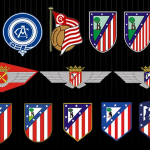
Last December the 9th, Atletico Madrid has introduced the new stadium and the new logo to its fans. It will be named Wanda Metropolitano after the name of the Chinese society (Wanda Group) that purchased the 20% of the club shares. As it was easy to imagine, Colchoneros’ fans didn’t agree on that choice, especially for the loss of historical identity. Also the restyling of the logo has not left the local supporters indifferent: they didn’t like the move of the trees and the forced attempt of modernization. This is, in fact, the politic that leads the managerial choices of the teams' manager from a few years: the desire of renewal finalized to the sale of the marks, to make them desirable to the markets more and more.
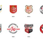
We have picked up some of the most symbolic cases and contested of the last years, starting with that of the Brentford, a club from the English Championship, that will have a new logo for next year. They deleted some of the characterizing elements of the badge to focus on its symbol: the bee. But the represented animal would resemble too much to a wasp, and in this way, the social identity is put in danger.
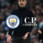
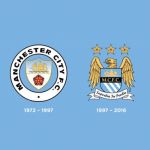
One of the most resounding changes has been that of the Manchester City. The society of Mansur in fact, has chosen a different road: they brought in life the first City logo, betting on the rose and on the boat, two city symbols. The stylistic result is sincerely impeccable, but the problem has been another. The affection of the fans to their own team is strong, and many of them tattooed the logo of the team on their own skin. With the change, a fed group of fans has asked funds to the society for the substitutions of the tattoos.
Also in England, we assisted to another “back to the roots” very important. Liverpool abandoned the logo that had been appearing of their jerseys for decades, returning to the minimal style of the 70s. In the transition, however, it has gone lost the slogan on the entry of Anfield and that made the recent Liverpool history: "You'll never walk alone."

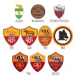
In Italy there have been no meaningful changes in the last years. After that of Juventus, the greatest revolution has been that of Roma, when in 2013 changed the interface of their crest from ASR for a more immediate ROME. The change coincides with the attempt of globalization of the society, with the American owners and with the trial that wants to make the Rome a desirable brand to investors and sponsor. It is the globalization, darling.