Fashion brands that have made national kits
When the relationship between the two worlds reaches the pitch
Sports
October 26th, 2022
October 26th, 2022
A look at this year’s World Cup kit manufacturers throws up all of the usual suspects, established names within the sport who are well-versed in the production of what are essentially pieces of athletic performance equipment, although football shirts have long since attained more significance as the sport continues its expansion into wider culture.
Aside from Iranian brand Majid, there is one other name that will be making their World Cup debut; One All Sports, who just recently signed a deal with Cameroon. Before this year, the brand had only produced motorsport gear, which has its own particular aesthetic, usually laden with motorsport-relevant sponsors and a distinctly functional appearance. They are yet to reveal Cameroon’s World Cup kits, but it will be interesting to see how they tailor their design process for a completely different sport. Portraying the national identity of a country is another new aspect of the challenge.
Over the years there have been other pretenders to enter the domain of football shirt design from other spheres, often on the international stage. Coming into such a specific sector of apparel design which has its own traditions, norms and functionality requirements, it’s intriguing to observe how some of the following fashion brands went about meeting the brief.
Levi’s x Mexico
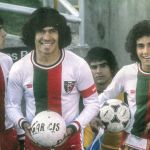
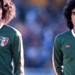
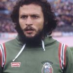
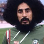
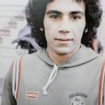
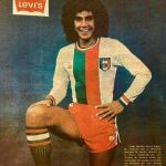
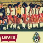
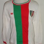
In 1978, long before the ubiquity of football x fashion crossovers, Levi’s took the bold step out of their denim-lined comfort zone and into the world of football shirt manufacturing. At the World Cup in Argentina, the Mexican national team took to the pitch with the famous red Levi’s batwing on their chest, but three stripes on their sleeves, shorts and socks. The Californian brand had no intentions to disrupt the football kit landscape. Their green cotton home shirt had a white v-neck collar and red and white stripes on the sleeves and the away jersey had tricolour cuffs and a matching round neck collar, while the central green and red stripe provided some asymmetry, something not too common in those days.
There is some debate as to whether Levi’s actually designed and produced the kits themselves or merely paid to have their branding replace that of adidas, in what would effectively have been a shirt sponsorship deal. Either way, they ended their association with Mexico after that disastrous tournament, in which they lost all three of their games, conceding 12 goals and scoring just two.
H&M x Sweden
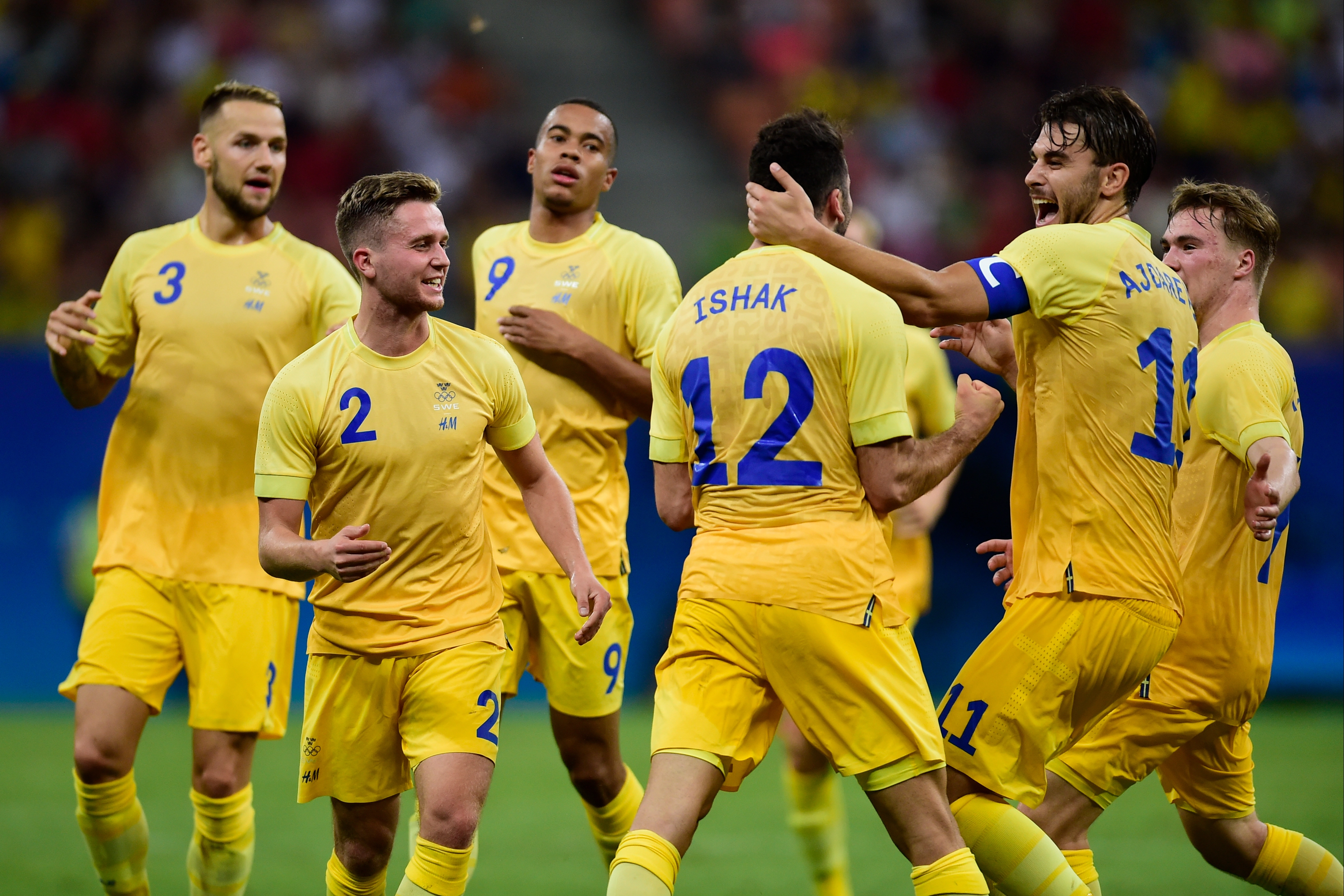


Football at the Olympic Games is governed by rather strict rules in relation to the equipment used and how it is branded, so we often see adidas jerseys free of stripes and federation badges replaced by national flags. When the 2016 Olympics took place, Sweden’s Olympic Committee had a deal in place with their fast fashion industry compatriots, H&M, who provided apparel to all of their athletes, superseding the Swedish FA’s Adidas contract.
The high street chain gave them a pale yellow home shirt with a subtle gradient effect and a navy and blue away jersey with tonal bands that became progressively darker towards the bottom (not dissimilar from the adidas away shirt they wore at that year’s Euros). Nothing revolutionary in terms of design and a fairly standard athletic silhouette, but the appearance of the H&M logo itself on the garments was unfamiliar, seeing as high street chains don’t generally brand their pieces. The decision to place the logo beneath the Swedish Olympic symbol - which itself looked like three separate logos stacked on top of each other - resulted in a slightly jarring look.
Uniqlo x Sweden


By the time the Tokyo Olympics eventually got underway in 2021, Sweden had a new fast fashion partner to dress the cream of their athletic crop. Their men’s team were not competing, but Korean brand Uniqlo kitted out the women’s football team, straying further from tradition than their predecessors had, creating a fluorescent yellow home shirt with blue accents, louder than any other jersey they’ve worn to date. Hoops made up of small crosses prevented the jersey from being too plain and the colourway was inverted for the away shirt, although the fluorescent yellow was swapped out for a softer shade.
Maybe it was just the red Uniqlo logo on the chest bringing Roger Federer to mind, or perhaps the strategically placed ventilation holes, but there was something about both strips which seemed borrowed from the tennis aesthetic. Uniqlo had previously made a number of kits for Japanese second division side Thespakusatsu Gunma, all of which had a more generic football kit feel to them. In comparison, their Sweden shirts show more confidence and readiness to experiment rather than merely play it safe.
Labrum London x Sierra Leone
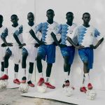
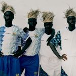
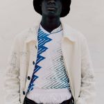
Foday Dumbuya grew up in his native Sierra Leone, Cyprus, and London, where he founded Labrum London in 2015. Through his creations, the brand aims to “tell the untold story of West Africa to help bridge the gap between western and West African cultures”. Often making use of West African imagery and symbols in his pieces, the task of dressing his home nation for the 2021 Olympics challenged him to transmit the diversity of Sierra Leone through a set of athletic clothing. Taking the blue and green from the country’s flag, the result was a pair of patterns applied in various styles for various sporting disciplines. Sadly, despite an official unveiling of the Labrum London Olympic uniforms, they were never used in an official capacity, allegedly due to the brand not being registered or approved by the International Olympic Committee.
Two football kits were created, with the interlocking S (Sierra Leone) and L (Labrum) pattern confined to the sleeves of the home shirt, while the away used 16 zig zag lines - to represent the 16 tribes of Sierra Leone - encroaching from the ends of the sleeves towards the centre of the jersey, changing from blue to green and growing in thickness from left to right. The placement and angle of the pattern varied slightly from shirt to shirt, giving it a greater sense of individuality. Definitely a standout from this list and possibly the designer whose background in fashion was most visible in the end product. Eye-catching patterns are nothing new to football shirts, but their use was more meaningful here than in a lot of cases and the execution is to be commended.