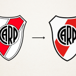
River Plate has changed its logo
A subtle but necessary rebranding
Sports
February 22nd, 2022
February 22nd, 2022
After 24 years since the last rebranding, one of Argentina's most successful and titled teams, River Plate, has unveiled its new logo, which will make its debut on the new shirts to be unveiled in August. A subtle but essential restyling, the Argentinean club has not altered or revolutionised its logo, but only removed the black outlines and updated the colours, making them more vivid and refined than in the past. Although the rebranding was born out of a marketing need, given that club communication now increasingly takes place on digital platforms, a logo that is too complex, too rich in realistic visual effects and gradients loses distinctiveness, the new visual identity takes inspiration from the past, specifically from the 1970s.
River Plate's rebranding demonstrates that the logo of every club is now a functional aesthetic object that is no longer just a means of identification. In fact, over time it has become one of the clubs' most important and expendable assets, which is why it is important to update it. In Italy, the last club to change its visual identity was Inter, which showed how important it is to keep up with the times, to be increasingly attractive in the market, both in its own city and worldwide. This is nothing new, the logo is the first point of contact that every customer or fan has with the brand, it is what makes us 'friends' in a certain sense and encourages us to support the company in question.