Come le Nazionali e le Federazioni stanno differenziando i loro stemmi
In vista dei prossimi Mondiali in Qatar, molte nazionali hanno effettuato un restyling dei loro loghi
Sports
February 18th, 2022
February 18th, 2022
In recent years, the love and passion of fans for their respective national teams have grown exponentially. Perhaps this is also due to the different competitions in which the various selections are constantly involved - most recently the Nations League, which in the first two editions saw Portugal triumph first and then France. In order to give greater relevance and identity to the National teams, various football Federations have decided to differentiate the logo between the football institution and the respective team. This is also a way to make both brands more recognizable, iconic and symbolic.
The FIGC and the logo designed by Lapo Elkann

Spain, the simplicity in RFEF crest

The differences in France and Germany
![]()
![]()


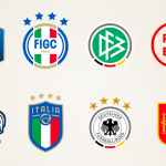
Throughout their history, both France and Germany have always had different logos between the national team and the Federation. The reigning World Champions have a simple stylized cockerel on their Nike uniforms, with the two World Cup stars at the top and the initials FFF at the bottom. The emblem of the institutional body, on the other hand, has the same images but is more like a classic shield with a hexagonal shape on a blue background.
The German national team, on the other hand, has a round logo on its jersey with a stylized black eagle in the center that goes back to the national coat of arms and dates back to when the Germanic tribes identified the animal as a representation of Odin. The Federation's crest shares the same outline of the circle, gray with the colors of the flag at the bottom - black, red and yellow - but within it on the green background are crossed the letters DFB, initials of DeutscherFußball-Bund.
The Serbia's choice
The last team to implement this separation was Serbia, which last November conquer the pass for the next World Cup, beating Cristiano Ronaldo's Portugal at the last minute. On the new uniforms that will be designed by Puma there will in fact be for the first time a different logo than that of the Federation. "The new crest that will adorn the jersey in the future will symbolize tradition, passion, dedication, unity and courage. All qualities in which our fans are reflected," said Vanja Kostic, marketing director of the Serbian federation, speaking about the new badge. On the jerseys of Vlahovic, Milinkovic-Savic and teammates there will be a logo with the two-headed eagle, symbol of the Nemanjic dynasty, considered the founder of the nation.
Beyond European borders, the restyling of Mexico and Costa Rica

Costa Rica also decided to change its logo in recent months, thus remedying the one carried out in 2014 and which was never accepted by many as a symbol of the nation. The logo, designed by the agency PUPILA after taking into consideration the opinion of fans and players, says goodbye to the circular shape to welcome a "volcanic" one that reflects the presence of many volcanoes in the small Costa Rican nation. The colors blue, white and red belonging to the national flag of Costa Rica have not been abandoned.