The identity of the Venezia jerseys
Featured in the UltràDelicious podcast on Spotify Originals by Maurizio Tentella
Sports
December 2nd, 2021
December 2nd, 2021
As every Thursday, Maurizio Tentella with UltràDelicious takes us on a journey of discovery through Italian places, telling us about the teams of our football but not only. After the intense trip to Naples, which we told you about last week, this time he took us to discover another unique city in the world, Venice. The Italian food selector as always managed to mix local culinary tradition and football, interviewing some of the best restaurateurs, telling about the great salvation of 1999 and the sporting history of its leaders Maniero and Recoba. But beyond cicchetti, spritz, Recoba's punishments and the Zamparini years, Maurizio Tentella interviewed Diego Moscosoni founder of Fly Nohere studio, one of the many people behind Venezia's four kits.
Part of Venezia FC's art direction this year was once again managed by the New York agency Fly Nowhere, for which brand, marketing, creative strategies and merchandise planning are followed and coordinated between New York and Venice. This year in particular, Diego Moscosoni and the entire team were able to bring together football with fashion and streetwear in four shirts that reflect and enhance the identity of Venice. And it is identity that is one of the central points on which the creative dwells in a brief vocal note sent to the presenter.


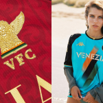
First of all, the American designer confirms what we all know: Venice already has a very important identity, the city is famous and admired around the world, and for this reason Diego Mosconi wanted to create at least four jerseys for the first season in Serie B."A football shirt is like a flag," says Diego Moscosoni, who wanted to create something special for the lagoon team's return to the top flight by carefully studying all the symbols of the city. For the home jersey, the inspiration for the pattern comes from the old city walls, mixed with orange, black and green, the club's social colours that are as distinctive as the stripes that Gucci has always used in its garments. A basic black jersey, but thanks to those veins it manages to stand out from all the others created by the rest of the clubs in Serie A and abroad.
The second and third jerseys pick up on two elements that are always very characteristic of the city, respectively the mosaics and the colour of the water in the lagoon. Two soft colours that at the same time exude all the history and artistic heritage that the city brings with it. The fourth and last jersey is inspired by the Contarina flag, the official historical banner of the Republic of Venice. Inspirations and references that show once again how the jerseys are strongly linked to the city, despite the modern and contemporary patterns capable of attracting and conquering every football jersey fan.