Roma's old logo is back
A choice that reopens the debate between tradition and marketing, in the year of the return to the past
October 25th, 2021
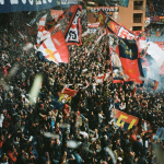
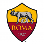
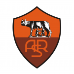
New Balance's new fourth Roma shirt brings back the iconic crest used on the Giallorossi shirts between 1997 and 2013, during which time they won the Scudetto, two Italian Cups and two Italian Super Cups. It's a return to the past that fans have been waiting for, in fact since 2013 when the management, led by James Pallotta, announced the rebranding of Roma. Even at the time, the Roma fans did not welcome the change of logo chosen by the American management, which was defined as "a symbol for a stall". After the presentation and the various protests on social media, a petition entitled "Give us back our coat of arms! ASR" which in a few hours reached more than 10 thousand signatures then presented to the company.
The clash between Pallotta and the fans had already begun in the second decade of the 2000s, when the American management decided to eliminate the historical acronym in favour of a simple "Roma". It was a choice motivated by the management to find the right global brand because the acronym ASR did not identify the club worldwide. The other change that infuriated the Curva Sud fans was the change from yellow to a brighter orange on the upper part of the shield.
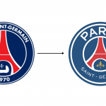
For a long time now, there has been an eternal struggle in football between tradition and marketing, future and past, which obviously divides fans and fans alike. In 2013, one of the first teams to completely change its crest was Paris Saint Germain. The sheiks, who had just taken over, took advantage of some turbulent events linked to the Parisian fans and changed the logo, eliminating some historical elements such as the royal cradle and adding a new management that intends to give more prominence to "Paris" than to "Saint-Germain", as evidenced by the size of the letters.
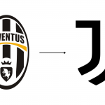
In 2017 it was Juventus' turn to change its logo in favour of a modern and stylised one that abandoned the classic forms, summarised by president Agnelli as follows: "we must evolve in our language, we must change our skin". It was a deliberate and deliberate choice, designed to bring the club into line with big brands such as Apple and Nike, which are recognisable to everyone through their symbol.
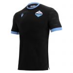
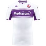
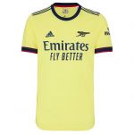
But if on the one hand there are those who look to the future, putting marketing above all else, on the other hand there are those who remain faithful to tradition and history. This year the decision to use the old logos in the second, third and, in the case of Roma, fourth teams has been repeated several times. In Serie A, Genoa, Fiorentina, Lazio and Atalanta have chosen this path, while in the Premier League, Arsenal has dusted off the old cannon, a symbol already present in the current logo. More than a trend, it is now customary for both brands and clubs to reopen the archives and be inspired by the past.
Roma's new jersey confirms how the Friedkin group is mediating towards a new transition, one that would bring back the acronym in the logo and re-establish the constant presence of the Wolf of Gratton, already for some years the Giallorossi trademark on the second jersey and on most of the merch of the Capitoline team. Could this also be a marketing choice to keep the relationship between the club and the fans strong? Impossible to say, what is certain is that the fans, despite the heavy defeat on the field of Bodo, are enthusiastic about the return (partial) to the old coat of arms, just look at some of the comments on social media.


