Why is adidas using two-color logos?
The aesthetics of the 90s in the style strategies of the German brand
Sports
September 13th, 2021
September 13th, 2021
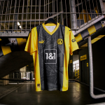
adidas has decided to use a two-tone version of the brand's logo on all the third jerseys produced for its five top clubs - Juventus, Real Madrid, Arsenal, Bayern Monaco and Manchester United. The decision to chromatically adapt the crest that first appeared in 1991 to the colours of the shirt is a constant in the aesthetic work of adidas, but in the latest wave of third kits something has changed. The three stripes and the lettering part are not the same colour, but adapt to the shades chosen by the designers in Herzogenaurach and the clubs: On the Juventus jersey, where yellow and blue dominate, the adidas crest is readapted with white and yellow; for Bayern the choice fell on blue and red, considering the background in light blue; the turquoise chosen for Real colours the logo in black and white; for the Gunners, the brand becomes white and red; for United, instead, the yellow and navy blue of the jersey is also reflected in the new shades of the crest.
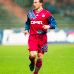
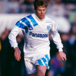
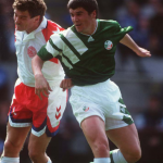
The decision to use a two-tone logo has deep historical roots in the history of football aesthetics in the 1990s. One of the most popular templates used by the German brand at the time was the EQT (Equipment), seen on the iconic jerseys of Bayern Munich, Liverpool, AS Roma, Marseille, Arsenal, Rangers and the kits of national teams such as the USA, Sweden, Japan and Ireland. The three stripes, which started at the top of a monochrome jersey and stopped either at the jersey sponsor or continued to the opposite corner, created a two-tone effect that adidas decided to take up by digging - once again - from its archives.
There was already an inkling of change in 2019, when adidas and Juventus decided to collaborate with Palace. On that occasion, the adidas crest itself was changed, creating an ad hoc one that summed up the co-branding work that led CR7 and his teammates to wear one of the most incredible jerseys of recent years. In the match against Genoa on 28 October 2019, Juventus took to the pitch in a jersey that mixed the bianconero style and Palace's vibrant green, while the adidas x Palace logo was green and orange.


This is not the first time that colour changes - even temporary ones - have been part of visual strategies at brand level. In addition to sports crests that often change their hues during rebranding (the latest example is Inter's Blue Klein), there are several examples from the fashion industry: the two most obvious are Tiffany and Bottega Veneta. In the first case, the brand of the LVMH group had joked on social media on 1 April last, announcing the change of colour from Blue Tiffani to yellow, but then realised the momentary switch by revolutionising the Rodeo Drive boutique on the occasion of an exhibition dedicated to yellow diamonds. As far as Bottega Veneta is concerned, the colour change started mainly from the packaging before reversing the entire colour scale - from sober colours (black, brown and beige) to the lively grass green introduced by Daniel Lee.