The 10 worst jerseys of Serie A 2021-22
Among new trends and design something went wrong
Sports
September 10th, 2021
September 10th, 2021
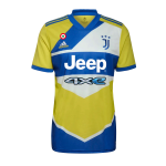
Everyone knows, a medal always has two sides and after telling you about the best jerseys of Serie A now it's time to see what's hiding behind the other. Despite the fact that this year there have been sensational innovations on the aesthetic front as Inter for the first and second jersey has taken inspiration from the biscione, symbol of the club or the three jerseys of Venice dedicated to the lagoon, there are also those who have not done very well. A case in point is that of Udinese that despite the prohibition imposed by the league for jersey sponsors to appear within specific boxes, both in the first and second jersey the main partner Dacia is delimited within a white rectangle, a detail that certainly does not embellish the jersey. Same colors but different city, we move to Turin, Juventus side, where the design of the third jersey inspired by the '90s proposed by adidas has not had immediate success, despite the yellow and blue are the official colors of the city. Those who have more or less re-proposed the same design of last year as Acerbis did with Spezia, where he only added a black stripe on the side. Finally, there are those who, like Verona, after surprising everyone with the first jersey dedicated to Dante, did not follow up on the good things done. From the top clubs to the newly promoted ones, here are the designs and patterns that did not fully convince, including important places like Atalanta, Lazio and Cagliari that would deserve a simply more beautiful jersey.
10. Cagliari - Away kit | adidas


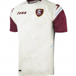
9. Salernitana - Away Kit | Zeus

8. Spezia - Home kit | Acerbis


7. Lazio - Away kit - Macron


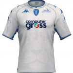
6. Empoli - Away kit - Kappa


5. Sassuolo - Away kit | PUMA


4. Udinese - Away kit | Macron


3. Hellas Verona - Away kit | Macron


2. Atalanta - Third kit | Joma


1. Juventus - Third kit | adidas