Can the Inter jersey open a new season of football design?
Where many have failed, Inter seems to have opened up a new path
Sports
July 16th, 2021
July 16th, 2021
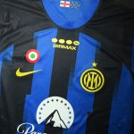
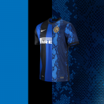
On Tuesday, Inter presented the home jersey signed by Nike for next season: it is an important jersey as it is the first with the new logo, without the historic sponsor Pirelli and with the return of the tricolor coat of arms on the chest. Confirming how this shirt represents a turning point in the history of the Nerazzurri club is the design: the entire shirt is dominated by a snakeskin pattern that recalls the skin of the Biscione, the historic symbol of the Nerazzurri club and the city of Milan. "The scaly pattern, which recalls the dragon, the Biscione, is a graphic element that I imagine will have tempted at least three generations of designers through the decades. It was just waiting for the time to be ripe to be unlocked," is the thought of DeeMo, the designer and art director who collaborated on the launch campaign of Inter's fourth jersey last season. The stripes are barely perceptible in the shades of colours composed by the scales that, like pixels, make up a jersey that for once it is fair to define unique and interesting, regardless of aesthetic taste.
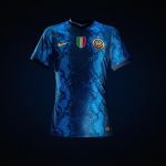


The design proposed by Nike and Inter fall into the macrocategory of 'revolutionary' jerseys or against the tradition of classic design. In fact, despite the spate of adjectives spent in press releases at this time of year, the football shirt is a difficult product to innovate in terms of design and often the chosen solution is the safest one. There have been attempts to innovate, many however have come up against conservative fan drives. In 2019, Juventus tried, wearing a jersey without the traditional black and white vertical stripes for the first time since 1903. It was not a success either with the public or with the critics despite some very good sales probably thanks to Cristiano Ronaldo. This year, however, Paris Saint Germain and Jordan have tried to take a new path, taking inspiration from the historic Chicago Bulls jersey of the '96 season, but the jersey has already sparked controversy from the more conservative fringe of the Parisian club's fans. The protest stems from the fact that next season's home kit makes no reference to the Hechter design, which is considered a stylistic institution and an inescapable symbol of PSG. Among the jerseys considered to be breaking yet winning is Nigeria's 2018 jersey, constructed with a zig-zag pattern in three colours and sold out in a matter of hours. "The new Inter jersey is the perfect representation of what I like to call the 'post-Nigeria' jersey. Since the Nigeria 2018 jersey defined the era, brands have been trying to replicate the success of the design which has become something of a phenomenon, reaching areas far beyond the typical football jersey", designer Phil Delves tells us. Inter, on the other hand, had tried to open a fracture since the previous season with the jersey with the zigzag stripes inspired by the Memphis collective whose works have marked the aesthetics of Milan - a cultural reference perhaps too niche to be understood and appreciated by all the public.


This year he is trying again, but the story is stronger and more convincing as Delves points out: "The snakeskin is a gamble, but despite the madness, there is a strong story behind the choice. That's what I like most about the jersey; it's a design that only makes sense for Inter as the snakeskin is a symbol of Milan. Even though there is an almost total lack of black on the shirt (the team will be more 'Azzurri' than 'Nerazzurri', which is perhaps not the worst thing at the moment...) this is modern football in its purest form. Delves is not the only one who appreciates the uniqueness of the shirt, also from Alberto Mariani in art Rupertgraphic pointed out the unique aspect of the shirt in relation to the aesthetics of the club: "it is not a banality: the Nerazzurri jersey being a classic score, it can be of Brugge, Rochdale, Atalanta, Pisa, Chambly, a shirt with the Biscione skin is only for Inter. This is not an Inter jersey but a jersey FOR Inter, which seems to seal a period of change: as the snake changes its skin, Inter has changed its skin too."


The jersey has obviously divided the opinion of the fans on social media, where they go from great appreciation to total rejection, while the results of our Instagram poll exalt and support the courageous choice of the Milanese club. One of the most frequent criticisms is the lack or rather the lack of relevance of the black colour, which seems to get lost among the pixel flakes, at least in the photos. There are also those who claim the lack of Pirelli, but that is a commercial choice, beyond this issue, we asked an opinion to an authoritative but aesthetically traditional fan as Mattia Buffoli of Interabilia, who says: "I personally like it very much, it is true that it is the first jersey that is totally different from the classic, but it is a concept that comes from the history of the club. I don't understand people who are scandalised by these changes, I see both black and blue and I think there are also the stripes after all." Generally speaking whether it can drive you crazy or not, this kind of design generates a response from everyone who looks at it, regardless of their level of interest in football and for that very reason it can really open up a new season of design.