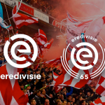
The new Eredivisie logo for the 2021-22 season
The crest that celebrates the 65th anniversary of the Dutch league
Sports
July 9th, 2021
July 9th, 2021
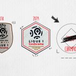
After the (silent) change of the Serie A logo, another European football league is ready to change its face for at least one season, the 65th in its history. The Eredivisie, the Dutch top league, has revealed the new logo that will be used for the 2021-22 season, 65 years after the league was founded. A process, that of the temporary and celebratory rebranding, that many sports organizations are applying as evidenced by the choice of the NBA a few hours ago.
La #Eredivisie cumple en septiembre 65 años por lo cuál durante la temporada 2021/22 usará una versión conmemorativa del logo lanzado en 2017. pic.twitter.com/ln6mWHQo6E
— planetafobal (@planetafobal) July 7, 2021
On 2 September this year the Eredivisie will, as mentioned, turn 65 and the logo will be just the tip of a campaign that will celebrate this special moment. The creation of the new version of the crest was entrusted to the creative agency of Amsterdam DOG & PONY, the same that took care of the total rebranding of the league in 2017. The logo in graphic terms does not distort the essence of the symbol of Dutch football, but adds details such as a series of thin lines around the "E". There will also be officially the number "65" that intersperses these bundles that surround the single letter, while the name "Eredivisie" passes from the bottom to the top.
The new emblem will be visible in all live broadcasts of the official Eredivisie matches, in social and digital content, on the website and obviously on patches, jerseys and balls for next season.