The timeline of the Italian national football team aesthetic history
Colors, crests and brands that have built the style of Azzurri
Sports
June 24th, 2021
June 24th, 2021
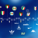
The history of the Italian national football team brings with it a unique aesthetic heritage that is second to very few other countries. The blue imprint in the history of football is not only made up of world victories, great successes and inimitable talents, but it is also and above all made up of jerseys that have changed history and logos that have become symbols of eras in the collective imagination cultural. In an ideal timeline that traces the history of the style of the Azzurri and the federation, there are crests (11) and brands (8) that have been significantly part of the last 123 years: from the symbol of the Savoy to the 4 world stars, from adidas at PUMA, passing through the 90s aesthetics and the all-Italian union with Diadora.
1898 - 1974: the blue tricolor and the three stripes
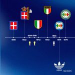
The first part of the timeline goes from the year of foundation to the first technical sponsor ever to appear on a blue jersey. Unlike the other European national teams - with the exception of Netherlands and Germany - Italy wears blue precisely because of the first logo, a tribute to the Savoy family. The evolution of the crest follows the Italian sporting history, which reaches its peak in the 1930s when the first two stars arrive thanks to the two world championships won at home (1934) and in France (1938) and the Olympic gold won at the Spiele der XI, the unforgettable and controversial Berlin Olympics in 1936. It will be the only Olympic triumph in Italian football history, but in this first phase will also come the European joy of 1968, in the match that was played twice. Less exciting is the part linked to the brands, both because of the regulation that did not provide for the presence of commercial logos on football uniforms and because the Azzurri until 1974 will not have a real technical sponsor. It will be adidas - with the clover version - the first real kit supplier of the Italian national team.
1978 -1992: Notti Magiche and much more
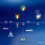
From 1978 to 1992 Italian national football team lived the most aesthetically incredible era of all, with football - and sport in general - becoming a stylistic thermometer and a mirror of the eras and cultures that populate the world. If on the one hand in just 14 years the Italian national team changes four brands, on the other hand the evolution of logos slows down compared to the first phase. There will be only three new crests, with the transition from the classic tricolor shield to the three-star logo thanks to the victory at the World Cup in Spain (1982). In those years there will also be two sponsors who will alternate: Le Coq Sportif will take the place of Baila, a small local brand that will last just over twelve months. The same fate also for Ennerre (1984-85) before arriving at the reign of Diadora which will hold for almost ten years. It will be the Venetian brand that will accompany us in two historical events such as the Italian World Cup in 1990 and the USA in 1994, with the final lost against Brazil on penalties. Before the American expedition, however, the FIGC changes its face again with a logo that combines the tricolor and the blue color with a typical design of the 90s.
1994 - present: the fall and the comeback
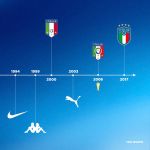
The last 25 years have been the most fluctuating, both on and off the pitch: from the 2002 scandal in Korea to the moments of maximum exaltation in the 2006 German World Cup, from the lowest point in football history with the failure to qualify for the World Cup to the rebirth current with 31 without losing by Roberto Mancini, passing through Nike, Kappa and PUMA shirts. An era with three new logos and three brands, all capable of transmitting different messages and an identity - even chromatic - which testifies to the evolution of the FIGC brand. Nike - which finds in the Azzurri the first Italian team to wear the Swoosh - changes the cards and brings the Italian artistic heritage to the national team jerseys, while Kappa literally revolutionizes the fit with the Kombat of a blue different from the other shades used. PUMA, which is today the longest-serving partner of the Azzurri with 18 years of sponsorship, has had ups (many) and lows (few) always managing to create something symbolic to unite team, fans and country.
The crests, on the other hand, remain almost unchanged from 2000 - with a clear rejuvenation of the logo - to 2017 with the only addition of the fourth star after 2006, before the umpteenth revolution of 2017, where the brand becomes even more modern and closer to design which also and above all aim at the commercial part of merchandising.
2021: the Renaissance brings good luck
![]()
In one of the happiest moments in the history of the Azzurri, Monday 4th October in Milan saw the unveiling of the institutional logo of the FIGC created by Independent Ideas, Lapo Elkann's agency. The image of the Federation has been renewed, flanking the shield with a modern and authoritative logo that depicts, also graphically, the process of innovation wanted by President Gravina. A new logo that marks a new beginning and that will carry with it all the great victories and records of this summer but not only. The inspiration comes from the first footballs from which it takes the circular shape and the vertical graphics of the new look with a clear and deep reference to the origins, the colours obviously recall those of the National team jersey and the tricolor.