
The best and worst jerseys of the 2021 Copa América
10 teams, 5 brands and an all-Latin aesthetic
Sports
June 15th, 2021
June 15th, 2021
The 47th edition of the Copa América started a few days ago in Brazil, with the four venues (Brasilia, Goiânia, Cuiabá and Rio de Janeiro) ready to host the greatest competition on the American continent. On the best Brazilian stages there will be the ten national teams that have reached the final phase of the South American tournament: Brazil, Argentina, Venezuela, Colombia, Uruguay, Peru, Chile, Ecuador, Bolivia and the Paraguay. Five are also the stadiums chosen to host the matches: at the Maracanã Stadium, the Mané Garrincha National Stadium, the Pantanal Arena, the Nilton Santos Olympic Stadium and the Pedro Ludovico Teixeira Olympic Stadium, battles will be fought to decide who is the best team in America.
There are also five brands present in the competition: marathon will be the most present brand thanks to sponsorships from Ecuador, Bolivia and Peru, followed by adidas (Argentina and Bolivia), Nike (Brazil and Chile) and PUMA (Uruguay and Paraguay) with two teams, the Italian brand GIVOVA closes the ranking with a single team. Brazil is the reigning national team but it is only the third in the general palmares with 9 titles behind Argentina (14) and Uruguay (15). But the aesthetics of a tournament that is concentrated entirely in the south of the continent is synonymous with masterpieces and disasters, with great jerseys and kits that instead border on the horrid. After the best and worst jerseys of EURO 2020, let's try to do the same with Copa América.
Top 3: Brazil, Argentina and Chile
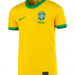
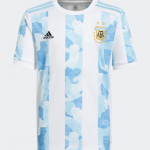
Itss not always obvious to find the Carioca and Albiceleste among the best jerseys of a competition, but this time Nike and adidas have given the Brazilians and Argentines two really special kits. On the one hand, there are the reigning champions who, with their home shirts, pay homage to the 1970 national team, the one that won the world championships in Mexico against Mazzola, Rivera and Ferruccio Valcareggi's Italy. Usual colors, usual sobriety but great application of the "less is more" concept. On the other hand, there is Argentina which reverses the course of its historical rivals, rejuvenating the jersey with a camouflage-style design that takes inspiration from the Argentine regions.


Different reasoning for the jersey that earns a place among the top three. The home kit of La Roja is a celebration of Mapuche culture and symbolism, the Chilean natives who make up the cultural column of the country, with the wings of an eagle and with geometric block motifs in the central part. The uniform is beautifully complemented by socks that reflect the block design in blue on a white background. Same goes for the away version, mainly red with blue and white inserts especially in the side bands. An excellent work of culture inside the football shirt. The away has not yet been worn by the men's national team, but it made its debut in the women's national team matches.


Flop 3: Venezuela, Columbia e Bolivia
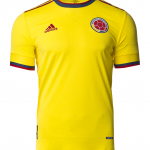
Before discovering what lies behind the flop jerseys of the Copa América 2021, it is worth saying that the kits of Venezuela, Colombia and Bolivia are not aesthetically to be trashed but given the history, tradition and style to which fans of all over the world, it was legitimate to expect something more. For Colombia, for example, adidas limits itself to what is strictly necessary, but is behind the times: the "less is more" principle is healthy and suitable when the shirt tells something, but in the case of the national team of Muriel, Cuadrado and Zapata there is very little. A template that looks like a decade ago for a team that has accustomed us to something else (just think of the Umbrian examples of the 90s).


The marathon experiments with Bolivia and GIVOVA with Venezuela are not successful either. The jerseys seem to belong to a stylistic era different from the current one, as well as the story that is built around one of the most important assets for the identity of the team. The Italian brand seems to have combined an adidas template with the "painted" design of the latest series of PUMA kits, creating a mix for the Vinotinto that is anything but excellent.