All UEFA EURO logos from 1960 to 2020
A not always successful visual identity history
Sports
June 14th, 2021
June 14th, 2021
A logo must be more than just a mark to identify the company, the brand or in this case a tournament. It must synthesise values, be recognisable and, above all, keep up with contemporary aesthetics. Looking at the EURO 2020 logo, some may be puzzled as to its effectiveness and beauty. It is a logo that follows somewhat dated rules and canons: it is crowded, full of colours and with different lettering. If you look at the latest rebranding cases both in the world of football (Juventus) and in other sectors - such as fashion and car manufacturers - a common trend emerges: simplification of design, absence of colours and the proverbial abuse of the Helvetica font. UEFA has never excelled in graphic taste in the last twenty years, although the logos of international competitions have entered the design books, just think of USA94, Ciao, the mascot of ITALIA 90. The history of the logos of the EURO is in fact very varied in terms of design, with a downward trajectory: if we want to trace its evolution, we could read it as a story divided into four different acts, which began back in 1960 from an idea of Henri Delaunay.
The origins (1960 - 1992)
![]()
![]()
![]()
![]()
![]()
![]()
![]()
![]()
![]()


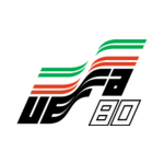


From 1960 until 1992, the logo of the EURO was never changed. Everything remained the same except for the colours of the flag and the year. A dynamic, waving flag accompanied by a bold, floating font used for nine editions. This design was certainly revolutionary in the 1960s: precise graphic fluidity and equally effective replicability. Of course, a logo that has been around for thirty years can be boring at some point. Today, it can be looked at nostalgically for an aesthetic that is making a comeback, but during the 1980s it was a far cry from the design of the time. In the 1980s edition, the one played in Italy, another logo was used, a stylised ball that takes the form of a flower. A design vaguely reminiscent of the primrose, used for the current vaccination campaign, or - rightly - a party logo from the decade of Bettino Craxi.
The breakthrough (1996 - 2004)


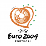
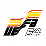
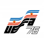
The tenth edition, in 1996, saw a real change in both visual and organisational terms, with 16 teams taking part. The standard logo, which until then had monopolised all editions, gave way to a new round design that UEFA would adopt until 2004, when Greece surprisingly won the competition. Brushstroke elements characterise all three logos, designed to highlight the dynamism of the sport but also the meeting of several countries and cultures, since in 2000, the European Championships were played for the first time in two different countries, Belgium and Holland. The result is more like a ghost wearing a multicoloured tunic, a positive note certainly being the use of the UEFA font.
The nature (2008 - 2012)


You may also like
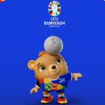
The new 2024 European Championship logo
From 2008, UEFA is again changing the design of the EURO logo. The basic idea remains that of highlighting the host countries, but the concept changes: from the colours of the flag, we move on to the graphic representation of natural elements that characterise the landscape. Nature is always slippery territory for a designer, and indeed the results were mixed. In 2008, mountain ranges, tinged with red, represented Austria and Switzerland, famous for their unspoilt nature, in an edition decided by "Nino Torres" and his goals. In 2012, the host countries are Poland and Ukraine, both territories that do not shine for geographical peculiarities.
The solution must have come in an astonishing meeting in which someone, after having tried to graphically represent plains and cultivated fields, proposed flowers to save the barque. An unusual choice given that none of the nations are known for it. In the light of the EURO2012 logo, there are those in Nyon who must have given instructions to abandon the natural issue and turn to something different.
The trophy (2016 - 2020)


Although many teams are updating their visual identity by simplifying their logos and coats of arms, UEFA and its graphics department have not followed the general trend. Since the 2016 French edition, won by Portugal, the star of the logo has been the cup on display, decorated with a colour palette supposedly reminiscent of the French flag with the addition of curious Paint-style asterisks and a curved line supposedly reminiscent of a pitch line. Only a year later Juventus presented its rebranding, and it is quite clear how aesthetically distant these two logos are. For the current edition, the first in history played in 13 different cities, UEFA's approach is still rather flat, as evidenced by the stylised fans in different colour palettes that form the background of the cup. The centrepiece of the new visual identity coming from the Nyon offices could only be a bridge, ideally connecting all the cities involved. Although the new font was unveiled a few weeks ago, belonging to the "san serif" family, the choice still falls to the one used by EURO2012. A choice that departs from today's aesthetics, where the focus is more on simplicity, while UEFA seems to be going the other way.