What's happening to the striped shirts?
How one of the symbols of football aesthetics is changing
May 13th, 2021
In recent years, the football shirt has become a thermometer of the aesthetic trends that populate football. The constant changes, the different designs always communicate something and the latest PUMA AC Milan jersey presented yesterday is synonymous with another stylistic twist. Over the years the vertical stripes on the shirts have undergone a significant evolution, transforming the traditional canons especially of Italian football into new trends that upset the "striped shirts" of the past. AC Milan, Juve and above all Inter Milan have decided to rework historical elements of their shirts making them more modern or even to eliminate them to make room for patterns that are closer to wearability off the pitch.
The trend of the reworked strips went hand in hand with the rise of streetwear where graphics have dominated the aesthetics of the hype for years. In this sense, the fashion industry has driven the football industry towards a reworking of the historical canons that the fans often did not like. Today the imaginative reworkings of the stripes continue - as indicated by the jerseys of the next Serie A season - but the trend reversal could be around the corner: contemporary streetwear has abandoned the colored graphics to return to normcore and it is not certain that football is not ready to do the same.
Vertical stripes appeared for the first time in 1883 in England, but were immediately taken up by clubs all over the world: Milan have been wearing stripes since 1899, Juventus since 1903 and Inter since 1908. But if on the one hand some teams jealously preserve the sacredness of the stripes - with the Celtic Hoops that have lasted since 1903 without yielding to any fashion - on the other hand there are those who have decided to reinvent them. Brands like Nike and adidas have decided, especially in the last 10 years, to revolutionize the classic use of stripes to create kits that break the traditional football aesthetic.
The most current example is AC Milan which, after incorporating the floor design of the Galleria Vittorio Emanuele II, continues the process of reworking the stripes with PUMA, proposing, from next season, a series of strips of different thicknesses that are repeated symmetrically. It was above all the change of brand that projected the Rossoneri into a new era, less traditional and closer to a young target and linked to current fashion trends. Although adidas has tried over the last few seasons - just think of the 2014 central band - the credit for the revolution goes to PUMA and its groundbreaking vision.
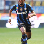
But if on the one hand AC Milan are the youngest team to follow the trend of changing the style of the stripes on the shirt, on the other hand Inter Milan is already at a very advanced stage of the process. Nike's rework on the Nerazzurri stripes began immediately after the Triplete, when in quick succession the new Italian champions alternated knurled stripes, very thin stripes in pinstripe style, asymmetrical stripes, a mix of style with a mash-up shirt, the union of vertical and oblique lines up to the Sottsass zig zag. Art and fashion that are intertwined very frequently on Inter shirts, with the culture and symbolism that blends clubs and cities. The novelty for next season - according to the leaks of the last few hours - could be a shirt without black lines replaced by irregular style stripes that recall the skin of a snake.
There are those, however, who have already tried to eliminate them in the 2019-20 season. Juventus is the first Italian "striped" team to abandon the stripes, replacing them with only two blocks divided by a single pink line. Not a particularly successful experiment, considering that in this season and in all probability also in the next the stripes are on the first black and white jersey. The 2015 Nike-adidas switch brought with it many stylistic innovations, passing from the three-dimensional optical effect of the stripes in 2012 to the "graffiti" design of the latest ones.
In the next season the classic geometric stripes and without particular decorations should return, with Juve that could therefore be the first to bring a concept of football normcore on a shirt - confirming the fact that the Turin club is always attentive to fashion trends to draw the maximum inspiration from the interests of an ever wider and more attentive audience.
Even outside the Italian borders there are those who have reinvented the use of stripes on the shirt. From Spain, for example, Barça has proven to be a pioneering club by challenging tradition and breaking down that wall that brings the Blaugrana shirts closer and closer to the concept of lifestyle. As in the case of Inter, Barcelona also begins its "stripes transformation" early: it begins in 2008 with the single blocks of two colors and gradually passes to a central "luminous" goose band (without lines), to a horizontal version of the stripes up to a complete new elimination, preferring a checkered design.
The stripes have become fickle, malleable depending on the artistic inspirations and service of the club's tastes. Whether they are zigzagging, whether they are almost painted as in the case of Atletico Madrid, whether they are placed in all directions as in the case of United's third shirt, the stripes are changing just like the aesthetics of modern football.
The link with fashion is always open and, considering the 20 months in advance with which the jerseys are designed and drawn, the trends that can be expected are those of a return to traditional stripes, just like the return of normcore on the catwalks has led to the abandonment of graphics. If the new idea of style is to prefer the archive to creativity and innovation, the future of stripes on soccer jerseys will return to the more classic stylistic regimes.


