The best 5 monochrome kits in the history of football
When normcore and "less is more" turn into legend
Sports
April 22nd, 2021
April 22nd, 2021
In the last five years or so we have been witnessing in both mens and womenswear a predilection for monochrome palettes matched with distinctively geometrical and boxy silhouettes. This style, motivated by the research for a versatile and sophisticated utilitarianism, has been also embraced off the haute couture catwalks, therefore becoming a cornerstone of brands such as COS, Zara, Other Stories and Olive, just to name a few. In football, though, the use of monochrome solutions seems to have been mostly limited to the back of kits, hence with utilitaristic rather than aesthetic purposes, so as to advantage the audience and the referees to better identify both the individual players and the teams on the pitch.
Monochrome patterns have no doubt been part of the aesthetic evolution of sportswear, resulting in a string of some of the most iconic kits in the history of football, proving the truth of the motto "less is more". After all, the charm of the monochrome surfaces of Yves Klein or Lucio Fontana has played a key role in the revolution of the art world. Similarly, kits like those of The Netherlands, Fiorentina or Torino, despite maintaining a certain sobriety throughout the years, have become synonyms with elegance on the pitch.
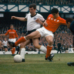
Italy Euro Belgium-Netherlands 2000
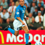
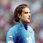
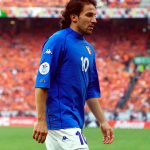
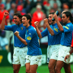
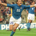
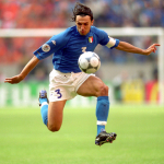
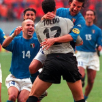
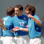
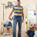
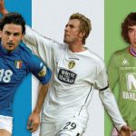
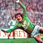
Despite monochrome patterns are often associated with retro football, Kappa was among the brands that were able to update designs with a classic feeling the most by adapting them to the necessities of technological evolution in matters of sportswear. The revolutionary Kombat model launched at the dawn of the new millennium blended the pop culture and fashion’s projection towards the ‘Y2K’ and Cyber aesthetics with a totally innovative design borrowed from surfing gear. Kappa stunned everyone - including Ian Todd, the marketing manager of the American colossus Nike - when dressing the Italian national team with its Kombat kit at the 2000 world cup. The shirt was the culmination of a process of research on materials and silhouettes that the Turin brand had already started in 1984 when stepping in as a sponsor for the US track team during the Los Angeles Olympic Games. The players in Kappa shirts nearly looked like cyborgs of a brave new world, coming together as one with their kits whose monochrome patterns augmented the jersey’s fluidity when wrapped around one’s muscles. The shirt - which got Zoff’s Italy to the world cup final - reintroduced after many years both the cut and the palette of the jersey worn by the Azzurri when they lifted the Euro ‘68 trophy. Twenty years on from the Kombat debut, it comes as no surprise to see brands like MISBHV and Marine Serre reproposing garments with such a fit in their collections.
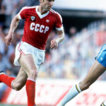
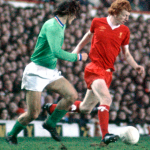
Leeds United 2004-2005
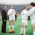
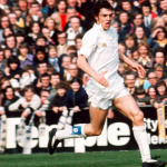
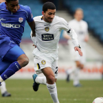
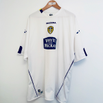
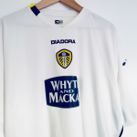
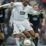
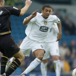
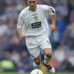
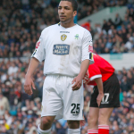
Within a few seasons the Kombat model was leading the way. By the half of the 2000s supporters started becoming accustomed to clashes in the penalty area where kits could stretch up to 50cm. Similarly, Kappa’s basic and sober kit designs started being adopted - with a further Cyber and neo-Space Age spin - also by Diadora. Monochrome kits like those worn by AS Roma, Luton Town and Leeds United, were therefore enriched by details like bichrome tabs on the left of the collar and by a motif composed of distorted circular shapes placed on both shoulders, which between 2003 and 2007 became identificative of Diadora more that its logo did. After all, despite traditionally wearing an all-white kit, Leeds United have always been a pioneering club in matters of kit design. Think, for instance, to the introduction of the ‘smiley’ logo in 1973 (one of the first modernist logos in football) as well as to the contractual revolution that occurred during the same season when, by hand of the then manager Don Revie, the club signed an exclusive deal with Admiral and wore the first branded kits in the history of British football.
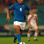
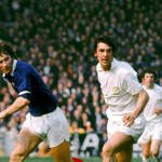
CCCP World Cup England 1966
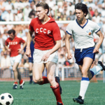
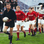
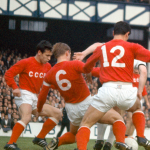
Sometimes all you need to turn a monochrome kit into a nugget of aesthetics it’s the fabric, sometimes it’s the crest or a graphic detail. The shirt worn by the Soviet Union in the 1966 World Cup is an example of both these elements. Manufactured by Umbro - that exclusively catered for the kits of all the teams taking part to the competition - the jersey was in heavy cotton, a fabric that matched to perfection the solid cuts and crew necks proposed by the English brand; as similarly proved by the perpetual charm of the Three Lions’ shirt.
Setting the kit apart was, no doubt, the oversized CCCP logo (acronym for Union of the Soviet Socialist Republics) embroidered on the chest rather than placed on the heart like it traditionally happened with other football teams. The jersey – like its 1977 version by Adidas featuring a crew neck and the three stripes in white and the 1988 and 1990 ones – embodied the sober futuristic elegance of Russian constructivism. The kit also seems to anticipate by several decades the knitwear tops with embroidered chest logos designed by Bella Freud.
Saint Etienne 1974-1978
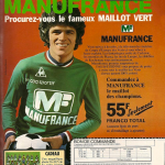
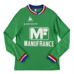
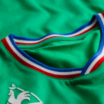
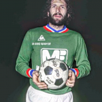
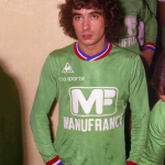
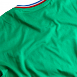
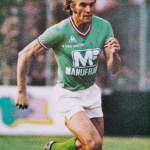
When it comes to French football, hardly any shirt can outcome the coolness the Le Coq Sportif kit Saint Etienne adopted from 1974 to 1978. Proving that timeless elegance and class lies in simplicity, the club’s traditional emerald palette was brightened up by the subtle yet fundamental three-striped collar and hems lining mirroring the colours of the French flag. The echo of the kit in pop culture was so strong that British band Saint Etienne even paid homage to the Transalpine team by adopting their name.
Chelsea FC 2017-18

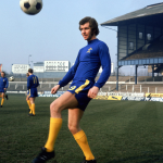

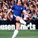
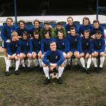

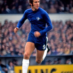
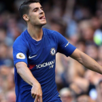

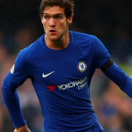
Not as ground-breaking as the Kappa Kombat, but Nike’s Chelsea shirt for the 2017-18 season surely represented – nearly twenty years on from the debut of the revolutionary Italy Euro 2000 jersey – a return to monochrome order in the Premier League. Nodding to the iconic shirt worn by the early 1970s Chelsea, the Nike top proves that it is still possible to conjugate the research for innovative sportswear technologies and materials with the respect for classic design. The shirt also draws an ideal parallel between Chelsea’s current UCL fame and the moment when the club turned pop at the height of the Swinging London, acquiring remarkable fans such as actor Michael Caine.