Behind the scenes of the Inter rebranding
We had a chat with Mirko Borsche, which guide us into the creative process of the new Nerazzurri logo
Sports
April 2nd, 2021
April 2nd, 2021
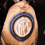
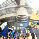
The new Inter logo has divided the fans, as expected. The "new language" that the Nerazzurri has launched is the last step - only in chronological order - of a growth path that starts from afar, just like its planning. The rebranding was handled by the design studio Bureau Borsche, already author of several rebranding in the fashion world such as that of Balenciaga and RINOWA. The Munich studio is one of the most renowned in the industry and among the brands that have collaborated with Bureau Borsche designers are Supreme, Nike, Givenchy, COMME des GARÇONS, Slam Jam, Études and Marcelo Burlon. A team of 12 people worked for a year under the supervision of Mirko Borsche, founder of BB, who told us the behind-the-scenes of the whole creative process.
In the past, the Graphic Design Studio Bureau Borsche has been involved in fashion rebranding projects such as RIMOWA and Balenciaga. What are the similarities and differences about designing a fashion logo compared to a sports one?
The reception of a brand design is subjective and emotional, whether it is a football club, a fashion brand or a program book for the opera. We approached this re-design with respect and admiration for all things Internazionale Milano. From the beginning on we decided to keep the original crests historic visual characteristics while concurrently making the shapes more simple. Most of the contemporary brands and companies don’t have such a rich history. And people might like brands but they adore football clubs. Working for a football club with such strong history and enthusiastic fans is something special and super challenging! Most people are not big fans of change, especially when it comes to something their heart beats for.
What was the first step of the whole creative process?
For every football club the crest is the holy grail—adored by millions of fans around the world. So working on the crest was the starting point but also the most challenging part of the process.


Football logos are quite traditional and difficult to redesign because of the club’s heritage, the fans and many other reasons, nonetheless there’s a clear path that has been opened by Juventus in Italy: what do you think is going to happen in the next five to ten years?
For INTER, and for European football in general, now is the time to introduce a new direction. It is time to face the challenges of our increasingly demanding world, both on and off the pitch and across the globe. For a football club to move beyond the stadium gates and weekly games, it needs to present itself as a global brand. To not only be present in society and in the world of sport but to emerge in the broader sphere of consumption (of goods and content), communication, and become a fully-fledged entertainment company. 100 years ago football clubs were able to communicate for only 90+ minutes on the pitch… now its 24/7 on social media. The consumption of content and the accompanying brand identity requirements have changed.
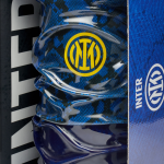
Color-wise, the new logo shifted from pantone 2196 C we moved to a pantone 286 C, with a blue that is much closer to Yves Klein's IKB idea. If you were to measure the specific weight of the impact of the new colors on the overall restyling of Inter, which figure would you choose?
The colors of the club were defined by Giorgio Muggiani in 1908, when he drew the original crest on the night of March 9th. Each color has a separate and specific significance. Ever Since the club was founded the INTER team has almost always worn Black and Blue stripes, earning them the nickname Nerazzurri. For the last 110 years the inter colors have only changed in gradation. We did the same. The Azure is now more intense compared to the old one. The new saturation brings a modern and digital touch. The same applies to the Gold. It appears now as a vibrant and powerful color – similar to the one used in the iconic 90s jerseys.


Inter have always shown both a great attention to the cultural tradition of the city and a great drive towards innovation. Over the past year a team of 12 has been involved in analyzing the club's archives in detail, putting together more than 100 years of history. Which elements in the new logo represent the tradition and which the innovation?
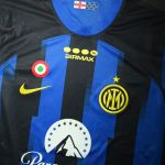
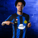
The whole redesign process revolved around that duality of the club–INTERNAZIONALE and MILANO. The club is proud of its MILANO roots and of its international fan culture. This pride is exemplified and amplified in the new crest. INTERNAZIONALE "I" and MILANO "M" are more prominent than ever before. The "I" remains at the center of the crest. Though slightly modified the "M" retains it’s unique overhanging arms. The symmetrical "M" remains behind the "I". The circular foundation of the rings also remain intact. Overall the visual appearance of the new crest hints at the old one. The relation of space between letters and the whitespace in between remains almost the same (around 90%).
The logo has been universally called "digital friendly" due to its tendency to be noticed more on a small screen. Is it something that will define the logo design in the upcoming years?
Of course. Technical innovations have a big impact on society and on the consumption of content and media–accompanying brand identity requirements have changed drastically. At the same time technical limitations have an impact as well, a good example is the almost historical design movement of "fax" friendly logo design. Design is a fluid process as changes in society are.


An innovative process of change that saw Juventus as the progenitor of the movement and that sees Inter as the second player in the total transformation from a sports club to a brand. Who will be the next team to take this path?