What's behind Inter's new blue?
Distinctiveness of a new color or a tribute to Yves Klein?
Sports
March 30th, 2021
March 30th, 2021
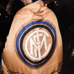
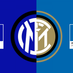
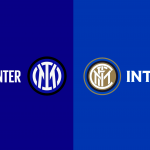
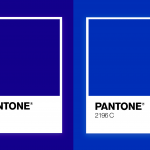
The rebranding of Inter, curated by the design studio Bureau Borsche, has brought with it an almost infinite amount of news: new name, new structure, new claim but above all new colors. There is very little left of "Nerazzurro", because the blue used by the current Serie A leaders has literally transformed into a much darker shade closer to midnight blue. In terms of color, therefore, what has been a Pantone 2196 C over the years has become a Pantone 286 C - chosen from a selection of more than 300 logos.
The creation of the new logo required a team of 12 people and a whole year to complete a project that launches Inter - and the brand it has created over the years - in a different dimension, full of tradition and futuristic at the same time.


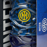
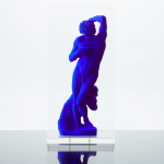
An interesting intuition of Alberto Mariani, an Italian graphic designer who has always been close to the colors (both old and new) of Inter, once again links Steven Zhang's club to the artistic forms of different eras. In the latest in-depth analysis of Bauscia Cafè, @rupertgraphic brings to light a color that is very close to the shade chosen by Kolja Buscher (coordinator of the Inter project and already the main mind of the rebranding of Balenciaga). The nuance in question is Blue Klein, which takes its name from its creator Yves Klein.
The story of the French artist is very particular and in 1955 he concentrated all his energies on a single color: blue. The following year he created, by patenting it, what is universally defined as "the most perfect expression of blue" due to the total absence of color alteration. International Klein Blue (IKB, = PB29, = CI 77007) is what comes closest to the blue chosen by Inter for its new suit.


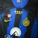
Inter will have to redesign its entire world, starting from the website to the social networks, repainting everything that was once "nerazzurro" in "black and blue". And if this new type of color brings you some annoyance, it is quite natural: IKB and black are not made to be together, because the combination creates a clear alteration of the three-dimensionality. Even in the fashion world, the two colors struggle to coexist for clear reasons of combination.
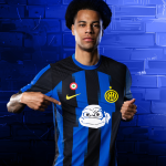
But it's from fashion that Inter are perhaps trying to draw inspiration. The "exaggerated" scenario represented by words of Alberto Mariani is based on the distinctiveness of color. In the idea of the graphic designer, Inter would be trying to paint the imagery of its millions of fans through a single color, such as red for fashion. The results of the color conversion will reveal Inter's true goal and the effectiveness of their bold choices.