The understimated aesthetics of Bundesliga
From top to bottom of the ranking there are great graphic traditions
February 19th, 2021
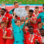
With Bayern Munich's dominance thanks to the Champions League win in Lisbon and two out of four teams both in the Europa League and Champions League semi-finals, the Bundesliga has greatly catched the eyes. But in reality, as some recent presentations also demonstrate, the aesthetic side of the German championship also has great potential. Unfortunately underestimated.
In fact, the latest publications in Stuttgart and Mainz 05 - combined with adidas' inclusion of Bayern in the Human Race project in October - have highlighted a underlying aesthetic of the German league, in which, in addition to top clubs Bayern and Borussia Dortmund - plus a new entry in Nike's Elite clubs, Leipzig - there are many other interesting clubs for the production of jerseys. In Germany, home of adidas and PUMA, over the years first-level aesthetic systems have been canonized, not affected by history, capable of creating a continuous thread between the reality of the Eighties or Nineties and the contemporaneity. In fact, many uniforms that this year (or in recent seasons) have been seen in the Bundesliga, keep the templates and certain old graphic schemes, a symptom of the continuation of a style that has not stopped.
Over the past decade, for example, both some of the classic united-colored jerseys - Bayern, Stuttgart, Werder Bremen among others - and bands in various positions are still a constant for many clubs. From the classic Bayern model to the Schalke 04, from RB Leipzig to Stuttgart, solid color has always been a trend of the German league, and uniforms, very often, have presented alternative colors, sometimes fluorescent. As well as Bayer or Enitracht Frankfurt have canonized the Red and Red stripes. But the fact is that each club has its own tradition, its own distinctive feature in addition to the simple colors. We had already talked here about the Pantone colours of the Bundesliga, and already a heritage of each club was emphasized, not only of the main Bayern and Borussia, but also of the more historical ones, such as Hamburg (which is no longer in the Bundesliga) and Herta Berlin. What stands out in fact of the aesthetics of German jerseys is the transversality between large and small clubs in the authenticity of their graphic model. That too often is not noticed.
Then there are other teams that have made pantone color their own story, a canonized model and become famous all over the football world. Like the dark green of Werder Bremen, or even the blue of Hamburg, which was then for a long time mixed with white and red. By the way, the Hamburg SV team has always had (curiously) a good relationship with jersey sponsors - one of the first to have Fly Emirates as main partner together with Arsenal -, including TVSpielfilm, Hyundai, Sharp, BP, Hitachi and Campari. Another club that has refined its graphic style is Borussia Mönchengladbach, which has its own combination of green and white colors in a nuanced template and more generally with indefinite traits, especially in the nineties; or, in the first decade of the 2000s, a particular model was that of the double-colored vertical net skimming.
Finally, another thing that should be rewarded in the aesthetics of the German championship is the structures and communication. If stadiums are a source of inspiration for all clubs in Europe and deserve a separate chapter, the communication of the Bundesliga website is also to be appreciated - we had explained how functional and graphically beautiful the site and logo of the German league were, especially in comparison to that of the Serie A. A contemporary symptom of how fascinating and precious the entire Bundesliga aesthetic universe is, capable of going beyond the apparent enormity of Bayern Munich and Lewandowski. There's so much more.


