Logo evolution: the crests of the history of Paris Saint-Germain
The aesthetic evolution in the 50 years of life of the most hype club in the world
Sports
December 4th, 2020
December 4th, 2020
PSG is the most hyped team in the world of football. One of the reasons that indirectly contributed to achieving such a status is the "young" history that Paris Saint-Germain has behind them. Precisely in 2020 the Parisian club celebrated just 50 years, a teenager compared to the most famous colleagues. PSG, as in the case of AS Roma, was born from a merger, that between FC Paris and Stade Saint-Germain FC. In the 1970s it had become unbearable for Parisians not to have a high-level football team and, after having collected 20,000 signatures from Parisians, Guy Cresan, Fernand Sastre, Pierre-Etienne Guyot and Henri Patrell decided to found what is now the team of Nasser Al-Khelaïfi. The aesthetic evolution of the club is total, because in just 50 it has been able to reinvent itself and arrive at a stylistic consideration that goes beyond football.
1970 - 1990
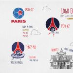


The first logo in the history of PSG is a blue ball divided into hexagons, one of which is hollow to represent a red boat, directly transplanted from the civic emblem of the city of Paris. With the word "Paris" written in large letters at the bottom, the logo will last only two years, from 1970 to 1972, the year in which the Eiffel Tower appears in the club logo for the first time. The symbol of Paris, represented in red on a blue background and with the crest frame in white, is completed with two elements: the royal cradle of Saint-Germain-en-Laye (emblem of the birth of the Sun King) and a lily, symbol of French power. The copyright of this logo belongs to Daniel Hechter, stylist and patron of PSG in those years. After 8 years, the logo undergoes a small change: from 1982 to 1990 the crest with the Eiffel Tower will be based on the silhouette of the club's stadium, the Parc de Princess.
1990 - 2002


A very brief aesthetic deviation of the logo belongs to the previous period: only for the 1986-87 season was introduced a crest formed by a white circle with two red and blue elements that evoked both the Eiffel Tower and the image of a footballer's legs. In the following two years the logo in use from 1972 to 1982 was restored, before the new logo that will arrive in 1992. Here we must speak of a real revolution in terms of design: the emblem passes from the sinuosity of the Eiffel Tower to three rectangles (two blue and a red one) with the letters P, S and G. Below is a black banner with a white sans-serif writing "Paris Saint Germain". Designed by the artistic director Étienne Robial.
For the next step, the change of ownership and entry among the Canal+ partners will be decisive. Paris has always been the center of protests and the same concept applies to football too. The fans, fed up with the logo with the 3 rectangles, rose up and convinced them to re-establish the previous logo, with some modifications. In 1996 the club's founding date (1970) at the bottom and a new writing (Paris Saint-Germain in sans-serif bold) that fills the upper part of the badge perimeter became part of the crest. Much more professional than the version with rectangles.
2002 - present


This brings us to 2002, the year of a new renewal, but only related to the background and spacing of the PSG crest. The logo remains essentially the same, but the background will turn entirely blue and the spacing between the letters that make up the club name will be reduced. A gold frame will be added in 2010 to celebrate the club's first 40 years of history. In 2011 there will be another change of ownership - with the entry of Qatar Sports Investments of Nasser Al-Khelaïfi - and another change of logo. In 2013, in fact, the latest version of the PSG crest will arrive, with the new management intending to give more prominence to "Paris" than to "Saint-Germain" as evidenced by the greatness of the letters. Saint-Germain does not disappear from the logo but is relegated to the lower portion.
Instead, the royal cradle will be removed from PSG's visual identity. The color palette meets new combinations, lighter in shades of blue, red and white - the colors of the French flag but also those of Paris. I will remain the heraldic golden lily, the fleur de lys. The special jerseys dedicated to the 50th anniversary of Paris Saint-Germain show the last two versions of the logo: on the home kit there is a logo with a gold outline, while on the away kit the outline is in silver.