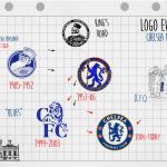
Logo evolution: the crests of Chelsea FC
A crazy story, from the founding of the club to the Abramovič era
Sports
November 27th, 2020
November 27th, 2020
England is the birthplace of football, The English Game. It is also the place where the first absurd stories of this wonderful sport were born and among these is that of what we know today as Chelsea Football Club. Before arriving at 1905, the year the club was founded, we need to go back 9 years until 1896. Henry - aka "Gus" - and Joseph Mears are two London businessmen, but they love business as much as football. In '96 they bought the Stamford Bridge Athletics Ground, the current Blues stadium, convinced that football could be a profitable business. But when they turn to the home team, or both Fulham, to make them play in that structure they receive a sharp "no". The investment doesn't pay off and the brothers cherish the idea of selling everything to the Great Western Railway Company. A colleague of Gus's, Fred Parker, not only manages to dissuade the brothers but manages to convince them that starting a team is a smart move.
On 10 March 1905 at The Rising Sun pub (now The Butcher's Hook) in Fulham Road, a new team from London was born. Unable to call it Fulham, the Mears decided to borrow the name of the neighborhood, which is Chelsea - not before failing London FC, Kensington FC and Stamford Bridge FC. A team with a very particular aesthetic history, perfectly represented by the evolution of logos. Logo evolution, third episode: we fly to the Premier League.
1905-1953


The club's first logo is the famous "Chelsea pensioner". The man portrayed in the logo is a veteran of the "seven years war" between England and France who wears a jacket with 4 medals of honor and the initials "CH" on the hat. The logo is inspired by one of the symbols of Chelsea, the Royal Hospital Chelsea. Chelsea's first nickname also derives from "pensioner": the pensioners. There is a double version of the first crest of the company: the simplest is blue on a white background, while the second is more articulated with the name of the club in full. It will last almost 50 years, before the aesthetic revolution of 1952.
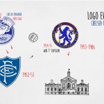
The 1952-53 season will be remembered as Chelsea's first crest revolution. Ted Drake, one of the best footballers of the 1930s, becomes the club's general manager and the first operation he puts into practice is a radical rebranding. The "Chelsea pensioner" is retiring again, replaced by a coat of arms consisting of the initials C.F.C. on blue background. It will only last a year and will never appear on the shirt, exactly like the other logos: the first will only be seen in 1960.
1953-1986


In 1953 the Chelsea logo began a new life, completely different from the previous two. From 1953 until 1986, the Blues crest will be a lion for the first time, a symbol that will accompany the club to the present day. In a rampant pose, the stylized lion looks back, while holding a scepter, as if looking over the team's back. The logo design is not created from scratch, but takes inspiration from the noble origin of the club's era owners: the Counts of Cadogan. In addition to the rampant lion there are 3 roses (symbol of England) and 2 footballs. This will be the first logo to appear on the Chelsea blue shirt.
1986-2005
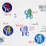


After 33 years the corporate structure of the London team changes and the ownership passes from Earl Cadogan to Ken Bates, one of the most controversial figures in the English football scene due to conflicting relationships with the fans. He bought the club for 1 pound, given Chelsea's enormous economic difficulties. The transition from Cadogan to Bates is also the transition from the rampant lion to the roaring lion. In fact, from 1986 to 2005, 5 chromatic versions of the logo will alternate, perfectly identical from the point of view of style but with different shades and backgrounds. A peculiarity lies in the latest version of this crest. Although Chelsea is always linked to blue, the "Royal Blue" hue will arrive only in 1912, 7 years after the foundation; until then, the team has been playing with colorful kits of a much lighter shade, like the background of the latest version of the logo.
2005 - present


This brings us to 2003, the year in which the era of Roman Abramovič begins, the Russian millionaire who for the centenary (2005) decides to comply with the requests of fans and re-establish the 1953 logo. Two years later, Chelsea changes face again, formalizing the transition to a stylized version of the rampant lion. The "restoration" has produced what we see today, a logo that is made up of 5 parts: the base, the blue circle, is the emblem of the Chelsea neighborhood; the lion once again recalls Stamford Bridge and Earl Cadogan; the walking stick, symbol of the Abbot of Westminster; the roses and the football, symbols of England and the English Game; the sign that reads "The Chelsea Football Club".