Logo evolution: the crests of AS Roma
From the Lupetto by Gratton to the she-wolf of Giallorossi
Sports
November 20th, 2020
November 20th, 2020
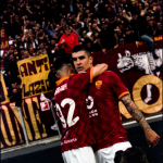
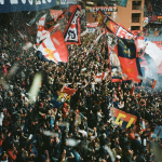
To keep up with the Eternal City you need an eternal football tradition, players who become eternal but above all an iconic and eternal style. A style that is not seen only through the shirts, through the great plays of Totti, Falcao, Pruzzo, Boniek, Nakata, Batistuta and many others. The crest of a club tells a lot of its history and its evolution perfectly represents all the dynamics that have accompanied the troubled love story between the club and one of the liveliest Italian fans for decades. In the second episode of Logo evolution we retrace all the stages in the history of the Giallorossi crest, from its foundation in 1927 to today's diatribes.
From the triumvirate to the single club
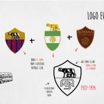
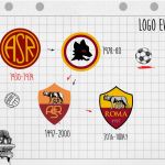
On 7 June 1927, in via Forlì 16, ASR Roma was born, as a result of the merger of three historic football clubs in the capital: Alba Roma, Roman Football Club and Fortitudo Pro-Roma. From this operation a unique club is born and the first crest brings with it elements of each of the 3 logos: the she-wolf (immortal symbol also of the city of Rome), the shape of the shield and the division into two distinct blocks of the logo. In the upper part the she-wolf on a yellow background nursing the twins, while in the lower part the acronym in white on a red background "ASR".
The symbols of the first victories
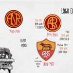
In the 1941-42 season comes the first historical Scudetto and the Giallorossi jersey stands a different logo from the original. In the spherical shape there is only the acronym "ASR", with the story between crest and jersey that has yet to be fully born. The Roma, in fact, began later to use the logo on their shirts, playing for so many years with a completely clean mesh, without emblem. There is no real reason to justify this choice, but the evolution of the logo continues to accompany the wolf and the acronym of the club until the end of the 60s, when things start to change - not necessarily for the better.
AS Roma vs City of Rome


Although the "Lupetto" designed by Piero Gratton is always combined with a phase of the evolution of the Roma logo, there is a specific duty to do. The change of logo that arrives at the end of the 70s coincides with a "battle" between the Giallorossi club and the City of Rome, which decides not to grant authorization to use the symbol of the city of Rome. The she-wolf and the twins must be replaced and Gratton finds the perfect solution, launching the first idea of a "brand club" in Italy.
Thus will come the iconic symbol of the stylized cub, in its first black version with red eyes and enclosed in two circles - obviously yellow and red. Given the great success, the club decides to experiment with that design masterpiece with different colors: in the next 15 years it will change contours and palettes four times. Only in the mid-90s AS Roma wins its battle against the Municipality of Rome and manages to re-establish the first logo. Meanwhile, in 1993, Francesco Totti made his debut with Lupetto, who made his way a bit with the Giallorossi shirt.
Tradition vs marketing: the eternal contrast
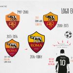
The constant changes of technical sponsors do not help the health of the crest of a club that has to deal with the most fundamentalist soul of the majority of fans. The clash between tradition and marketing began in the second decade of the 2000s, when the new American leadership decided to eliminate the historical acronym in favor of a simple word "Rome". While the only change in terms of design in the last 20 years is the change from yellow to a more lively orange at the top of the shield, on the other hand the change due to marketing reasons infuriates fans of the Curva Sud.
The Friedkin group is mediating towards a new transition, the one that would carry the acronym in the logo and would constantly re-establish the presence of the Lupetto di Gratton, the Giallorossi trademark on the second jersey and on most of the merch of the Capitoline team for some years.