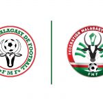
The new style of Madagascar logo
Designed by Randrianjafimanana Zofitia
October 23rd, 2020
Among 590 proposals to redesign the logo of the Football Federation of Madagascar, that of designer Randrianjafimanana Zofitia won over all. The Malagasy sports movement is rebranding the sports apparatus with important aesthetic innovations, both in the structures and in the international brand image. One of the first steps was to reinvent the coat of arms with which the team will play the Africa Cup of Nations for the second time in history.
The choice of the new logo did not want to completely resize the old coat of arms, but only to redefine its features. The colors are in fact the same as the old logo and, in practice, also the circular shape with the bull in the center. But the design is much improved. The circular space of the contours was filled with the red color, the bull was redesigned and in the middle the horns were also inserted the shape of the African island. Under the bull, on the other hand, there is a horizontal band with the social colors of Madagascar, and the balloon, large in the center of the horns, was moved below. The coat of arms is also characterized by a glossy style, a technique widely used in the design of logos at the beginning of the millennium.
Madagascar has also grown a lot on the pitch in recent months, reaching the first historic qualification for the Africa Cup in 2019, winning its group stage and even reaching the quarter-finals, defeated by Tunisia.


