The new unique typeface of J-League
A strategy to improve the brand of the most important japanise football championships
September 21st, 2020
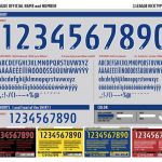
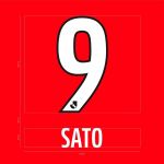
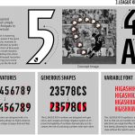
With the aim of improving the aesthetics of the League and improving the visibility of tournaments, the Japanese J-League has imposed a unique font type for all clubs belonging to its competitions: J1 League, J2 League, J3 League, League Cup, J1/J2 Play-Offs, Super Cup. The new typeface will cover both the names and numbers on the back of the shirts and will be called J-League Kick. The colors chosen for the new character are red, yellow, blue, black and white and will be set on the uniforms of the teams starting from the 2021 season, which in Japan is expected to start next February.
According to the organizers of the various Japanese competitions, the homogeneity of the fonts should ensure a better quality in the watching of matches - especially on smartphones and tablets, the new devices to follow matches - and, at the same time, increase the visibility of the J-League brand: the will is in fact to build a strong and attractive football brand, and the Japanese strategy is to follow some choices seen also in Europe , such as in the Bundesliga, in the Premier League, and from this year also in Serie A.
The font was created by Danish design firm Kontrapunkt, a leading global graphic designer. The new character of the J-League is made inspired by the 'lap shot', one of the most iconic sporting gestures of all time and a combination of style, physics and technical skill. In essence, the sinuousness of the characters would like to recall the trajectory of the lap shot so as to highlight, together, its elegance and skill.


