The new jerseys of the promoted clubs in Serie A
For the first ever, technical partner Acerbis will be in the top league
Sports
September 16th, 2020
September 16th, 2020
With the official presentation of the Benevento Calcio shirts, the picture of the uniforms of the newly promoted clubs in Serie A is completed. The Witches, in fact, presented on social media the new kits signed - for the second year in a row - by Kappa, proposing as the first jersey the striped one with the traditional yellow colors, the second white with bands with social colors, the third blue tending to gray, and then a fourth, black, also with stripes with social colors.
The Turin brand has worked on the particularity of the lines to make the kits original and innovative, but without leaving the tradition aside. A bit Barcelona FC-style, on the back of the shirts is written in silver 'more than a yellow and red', a slogan that wants to communicate the sense of community that unites fans and players, which, in fact, is a relationship that goes beyond the colors of the shirt.
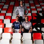
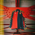
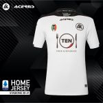
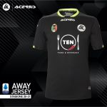
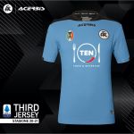
However, the first newly promoted to present its uniforms was the Spezia, which last week released the three kits of the first historic season in Serie A. Historic as the first time of the technical partner, Acerbis, a Bergamo brand known for sponsorship of drivers and originally born for the production of automotive material. To dress the spice on the fields of A, Acerbis has made three uniforms respecting the colors of the others of the past: the first black and white, the second black, the third entirely blue. The design is very standard and, on all three jerseys, the fork of the main sponsor's logo 'Ten' stands out.
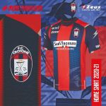
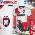
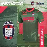
Crotone FC for the fifteenth season is branded Zeus, a Campania brand that had already dressed the Calabrian club in the other two seasons of Serie A. Again, Zeus complied with the standards of social colors, presenting the first, classic with blue and red stripes - with zigzagged features in the stripes -, the second white and the third green. Zeus wanted to experiment a lot with these three kits, creating references to the club and the history of the city: on the second, the pattern has a red and blue oblique strip cut sharply in the center by the white square of the main sponsor St. Vincent. The strip, however, is very nuanced and with indefinite contours, a pattern that refers to the smoke bombs and choreography of the curve of the Ezio Scida. The third also features shades of light green on the dark green pantone of the template, with pink-colored edges, collar and sponsors: the "erode" texture is a reference to the ruins of the hera Lacina temple in Crotone. In addition, on all three jerseys, at the bottom left, there is drawn the relief of a shark, symbol of the Crotone FC.
The models of these shirts almost seem to meet the expectations of the three teams next season in Serie A. Benevento, already with experienced players, seems the best equipped to support the next league, and its kits well represent this security - moreover, the Campania club is the fourth club sponsored by Kappa in the top league. Crotone is instead a team still poorly defined, who know how to play in Serie A, but that at the same time does not seem to have the right means to be able to support it at its best, as well as the uniforms: although the first may be standard, they are of an incomprehensible originality. Instead, the uncertainties of Spezia's first time in Serie A are all reflected in the poverty of the design of the shirts, in which, as said, the sponsor's logo is the master.