Hellas Verona will change its logo after 25 years
A rebranding operation that looks to the future
Sports
June 1st, 2020
June 1st, 2020
25 years after the last change, Hellas Verona decides to refresh its logo and take on a new graphic design: in fact, from July 1st we will no longer find the oval logo with the inscription ''Hellas Verona'' in the center, but we will have to get used to seeing a new one, more minimal and that will have a more transversal use.
The process put in place broadly follows a rebranding strategy already seen in 2017 with Juventus which has traced - at least in Italy - the road to markets parallel to that of football such as fashion, communicating the brand image in a much more universal way.
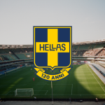
The company's goal is to start the new decade with a more modern logo, so that they can celebrate the next three company anniversaries (the 120th and 125th birthday as well as the 40th anniversary from the Scudetto) by keeping up with the times but without forgetting the origins of the club.
In fact, as we had told here, although our country is historically tied to traditions, it is difficult to find total disconnections between two different versions of the same logo, this is because the companies want to give the fan back an idea of historicity and a sense of belonging that the ''old'' crests are able to evoke.
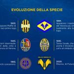
And it is for this reason that two of the three guiding elements of the new logo lead back to the old one from 1995 and even more to the 1984 version designed by Osvaldo Bagnoli:
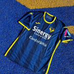
the two mastiffs, central elements, evoke the most important Lords of Verona, the Mastino della Scala I and II; the stair with four rungs is the symbol of the city and refers to the Lordship of the Scaligeri; the colors, yellow and blue, return to being two, declinable as needed together with white.
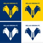
The restyling aims to update and simplify the Hellas Verona brand through flat design, giving cleanliness, linearity and clarity in order to maintain the characteristic brand identity of the Gialloblù, allowing the new logo to be recognizable and reproducible at the same level of the old one.