The 10 best shirts of the Azzurri
From Spain '82 to Euro 2016, the most beautiful uniforms ever worn by our national team
Sports
May 25th, 2020
May 25th, 2020
Shortly before the pandemic that would have upset the football calendar of this and next season, the Footy Headlines website had leaked the home kit that Roberto Mancini's Italy should have worn at Euro 2020. The uniform, made by Puma, was a derivation of the ''Rinascimento'' shirt - the green one with golden inserts - presented in 2019, and which had the distinctive and characterizing elements in the blue of the collar and sleeves and in the geometric figures of the plot. An innovative product that, pending the test of the field, is a candidate to enter the collective imagination of the fans. Like these first ten of her, used in major international tournaments and gone down in history for their beauty.
10 - Confederations Cup 2009


On the occasion of Italy's first participation in the Confederations Cup, Puma opts for a light blue that recalled the National World Champion in 1934 and 1938. Aesthetically enjoyable as long as the combination is not with the horrid ''admired'' brown shorts in the games against the United States and Egypt.
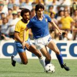
9 - World Cup 1978


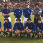
The World Cup in Argentina meant the World Cup south of the equator, so the World Cup played in the harsh southern winter. And, therefore, the World Cup played with long sleeves. That of Italy, in a more ''cold'' tone than usual - perhaps to adapt to the atmospheres of Giovanni Arpino's Azzurro Tenebra, released just a year earlier - was affected by the weight of tradition and the memory of the ''Partido del Siglo'' from Mexico City and the victory of the European Championships in 1968. Then round neck, tricolor shield on the chest and the innovative numerical characters of adidas as the only element of modernity.
8 - Euro 1996


The Nike era began in 1995, with the introduction of gold inserts and details as a testimony to a cultural and stylistic revolution that, off the field, began to identify the "new forward" in streetwear in jerseys. Guarantees Paolo Maldini, protagonist of one of the coolest commercials ever.
7 - Euro 2016


Twenty years later Puma focused on the pinstripe elegance for one of the most "worker" (and most exciting) national teams ever. Presented in the Hall of Arms of Palazzo Vecchio in Florence with Buffon, Chiellini, Gabbiadini and Verratti - the only ''intruder'' among the faces of the German brand - that shirt gave Antonio Conte's boys that aura of invincibility broken only at the moment of the penalties of Zaza and Pellè.
6 - World Cup 1986/1990


Shades tending more blue than blue returned on the occasion of the 1986-1990 five-year period, with Diadora becoming the first Italian brand to be entrusted with the design of the national team shirt. The tricolor inserts on the collar and sleeves have been confirmed, a true leitmotif of Italian football in the 80s and 90s.
5 - World Cup 1998


Ingeniously branded by purists as too "anonymous", the kit that Nike thinks for its national teams engaged in France was, in reality, the last extreme of the 90s solid color design. The result, especially in the "total blue" look seen in the knockout phase, was more than appreciable and did not deserve to end up in oblivion only because of the rigor of Gigi Di Biagio.
4 - World Cup 1982


The shirt that Paolo Rossi delivered to immortality on the Bernabeu night was the first designed by Le Coq Sportif who introduced the tricolor inserts on the sleeves and collar, a real distinctive element also in the following years. The design was simple and linear, the blue of the "right" shade: the rest was all emotional value.
3 - Euro 2000


After the 1999 agreement, Robe di Kappa took the aesthetics of the national jersey to a higher level, marking a profound break with tradition and not only because, for the first time, the technical sponsor could show his logo. The ''Kombat 2000'' which brought the blues one step away from triumph on Dutch soil is the first "slim-fit" shirt in history, in a historical period in which the big brands were still grappling with the fabrics in polyester who wore loose. At the time of the presentation, the communication of the Turin brand focused on how the tight-fitting shirt would have better highlighted the restraints, in accordance with the ancient Italian tradition of the search for controversy and the dark hand that weaves the plot of the arbitral plot. The solution of the logo on the right sleeve is remarkable to complete the triptych made up of the patch of the event and the three stars of the order.
2 - World Cup 2006


Stars that became four six years later in Germany. The main novelty brought by Puma consists of the ''navy'' shades in blue on a light blue background, a game of noteworthy chromatic variations, which are most appreciated in the single-color version of the kit. The tricolor and logo were positioned centrally one above the other, the tiny gold-colored block template made the visual effect even more pleasant.
1 - World Cup 1994


But since victory is not everything, when it comes to aesthetics there can be only one number 1, the most beautiful shirt ever worn by the national team in a big event. Shades halfway between bright blue and electric blue (iridescent according to the type of light present) logo of the federation silk-screened, three-dimensional numbers, futuristic lettering, the white and red triangles on the sleeves and collar in place of the traditional tricolor finishes. And most of all, it was Roberto Baggio's shirt.