The 10 most beautiful fonts in the A series in the 10s
How to make a jersey even more beautiful in a few moves
Sports
May 18th, 2020
May 18th, 2020
We have already talked about how, from the '20/'21 season, the Serie A teams will have to use a unique font for names and jersey numbers. A choice that would avoid the risk of seeing fonts with questionable style and readability used, capable of ruining uniforms that in reality were characterized by an original and interesting design.
The use of a single font for all the teams in our championship will allow the jerseys of the teams in the top flight to visually communicate a sense of homogeneity and stylistic uniformity of the league. By doing so, however, we will no longer be able to enjoy some fonts seen in recent seasons, which can further characterize some of the most beautiful jerseys in the recent history of our football.
Napoli '17/'18

Napoli has had a fluctuating relationship with the design of the shirts in recent years with Kappa which has alternated, as regards the fonts, well chosen choices with some more questionable. The latter case did not occur in the '17/'18 season, with Sarri's team at the time, sporting shirts with clean-style writing. For the first time, Kappa used Kombat design to design the shirt, combining a Sans Serif font inside which he inserted, in addition to the negative of the Neapolitan coat of arms, only a thin line.
Roma '15/'16

Another team that has hardly made a mistake in choosing fonts in recent years has been Roma, however focusing more on a more modern style than their Lazio cousins. Nike, for the '15/'16 season, uses a simple and graceless lettering for the Capitoline jersey, which stands out thanks to the combination for its cleanliness, and bold, Sans Serif numbers in relief. The pattern within the numbers represents the city of Rome seen from above, emphasizing the club's link with the city.
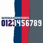
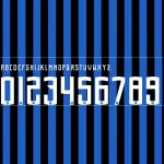
Lazio '15/'16
Lazio has been one of the companies that has most recently ridden the wave of vintage, which has also invaded the world of fashion. The style used by Macron in 2014/15 - here, in particular, there is that in the commemorative shirt for the 115 years of the club's history characterized by the frontal presence of a stylized eagle - is a clear reference to the past. The font used is Alma Mater Sans Serif, in relief, a font present on many shirts between the late 80s and early 90s. Among these, there was precisely that of Lazio at the time.
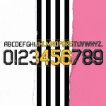
Bologna '12/'13
The font chosen by Macron for the rossoblu this season, is striking for its simplicity. Without many frills, this style is very similar to that used by different teams between the 90s and the 00s, and, at the same time, it matches very well with the wide stripes of the home shirt.
Juventus '11/'12
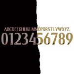
The Old Lady, with this font, has made the numbers and names of her shirts more readable. The design of the font represented the right compromise between tradition and modernity - reusing yellow as it had been done a few years earlier - and choosing a Gama font, embellished with darker colored bands, aimed at giving the font three-dimensionality, and by the club logo. A character that went well with all the uniforms used in that two-year period but, above all, with the second pink '11/'12 jersey and that was based on one of the first shirts in the history of the Turinese.
Milan '15/'16
The Rossoneri of Mihajlovic first and Brocchi then did not collect trophies but showed off one of the most beautiful shirts of the Rossoneri's recent history, embellished by the font chosen by Barbara Berlusconi for the name and number. A clean character, which seems to come from the present day and not from ten years ago. The lettering used for the names called ''Milan'', the same used for all the texts of the Milan house is elegant, as is the cross of San Giorgio which replaces the crest, but also contemporary.
Atalanta '13/'14
In the second season before the Gasperini era, the ''Dea'' uses a Slim Sans Serif Bold lettering associated with more rounded numbers, in which the Bergamo emblem is inserted. In the away kit and in the third kit, shades of black and gray are alternated to give a sense of three-dimensionality while in the classic Nerazzurri home they remain in total white. Also the size is right, making the texts recognizable but compact.
Fiorentina '17/'18
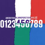
In the year in which Le Coq Sportif decided to celebrate the historic Florentine football with four different colored shirts - each representing a district of the city - the purples decided to associate a single font that united them; it is a Standard CT Bold Condensed which is reproduced in white on every uniform except on the white one, in which it becomes purple. Inside the numbers there is the Fiorentina crest.
Hellas Verona '19/'20

On this year's beautiful Macron uniforms, the Scaligeri use a rounded Core Mellow Medium: as regards the lettering, the ''classic'' character is maintained, while the numbers are embellished with lines that ''split'' in the middle digits, creating a striking yellow / blue contrast. Too bad they couldn't show it all season.
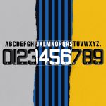
Inter '18/'19
In what was to be the year of the Nerazzurri rebirth, despite Spalletti's team finishing fourth at the end of the season, it will probably be remembered only for the third kit and for the fantastic font used, created specifically for the Milanese. It is a rounded Gothic-like that gives a certain solemnity to the names and a lot of recognition to the numbers.