MLS unveiled the new jersey font
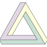
An optical illusion inspired by the Penrose Triangle and Necker's art
Sports
February 11th, 2020
February 11th, 2020
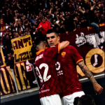
Maybe you already noticed it during the presentation of Chicharito Hernandez at Los Angeles Galaxy or looking at the photos of the show during which there was the presentation of the shirts of the franchises that will compete in the MLS 2020: during the season that is about to start all 26 teams (in the meantime Inter Miami CF and Nashville SC have been added) they will all use a new identical font of names and numbers on the back of the jerseys, conforming even more to the main European leagues such as La Liga and Premier League. And remember that the MLS franchises shares the same technical supplier, adidas, which sponsors them all. As stated by the graphic of the project to It's Nice That:
“The MLS is a modern, progressive and innovative league that is underpinned by being edgy, embracing technology and innovation. They wanted this progressive mantra to be reflected in the lettering, and were keen not to follow other football leagues around the world. They wanted something with originality, character and had strong ideas behind it — not another vanilla condensed sans serif.”


The Major League Soccer creative team got in touch with Englishman Rick Banks, who runs the Manchester studio Face37 Foundry, to create the ideal font for all the teams of the league. The new font is available in three different versions (MLS Streets, MLS Stands and MLS Pitch), and is inspired by the Penrose Triangle and the art of Necker:
“It’s a simple optical illusion that makes you look twice. And then look again. It seems impossible, but there it is, like some magic skills on the pitch. When layered on top of each other, the three weights create a “tri-line, something never before seen in football shirt lettering. This creates an energetic, 'swooshing' optical effect, representing the movement and energy in the game, like a Beckham free kick or an Ilsinho step over.”
The biggest challenge was to create a font that would fit perfectly both chromatically, and in the case of long names or with some accents, but above all that it would be sufficiently modern, in line with the development of the league, in great growth in recent years. The versatility also affects the dimensions, not only those of the kits to be used in the pitch but of course also those of the merchandising products, banners around the stadium or spaces to put on social media.