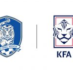
Here's the South Korean Football Association new logo
An almost total remake of the old crest depicting the white tiger
February 5th, 2020
Waiting to unveil the new Home Kit made by Nike, the KFA (Korean Football Association) has just announced the new logo, which has been circulating insistently in recent weeks. If the symbol of the South Korean federation, the white tiger, continues to appear in the crest, the difference between the old and the new logo is almost total: first of all the changes concern the shape, decidedly more modern and aggressive, and the colors used, bright blue, red, black and white to symbolize strength and willpower, dignity, belief and fair play.
The entire rebranding operation can be summarized with the motto: "Moving Forward". Changes can be simplified in four steps: the square frame of the emblem represents the football pitch, the tiger embodies the heritage of South Korean football, the shape the football lineup, while the design motif embodies the fundamental value of the project, 'Forward Arrow'.
A new typeface was also unveiled, KFA Gothic, developed in consideration of the symbolic elements of the fundamental values. As stated by Chung Mong-gyu, KFA president:
"The brand identity, including the newly announced emblem, is a reflection of the association's willingness to continue to challenge and change." I hope that all the members of our association are well communicated to the fans".


