The font of the collab between Juventus and Palace
A key detail of the first collaboration between football and streetwear
Sports
November 26th, 2019
November 26th, 2019
It's a shame we don't see the collaboration between Juventus and Palace anymore, the match against Genoa on October 30th will remain the only appearance of the first real collaboration between a streetwear brand and a football club. Among the major changes compared to the Bianconeri's Home Kit, the jersey made together with adidas and Palace has revealed a new font, also known as the great fetish of nss sports.
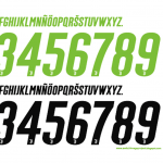
Compared to the white and gray camouflage, the new font is defined by the only unifying element of the entire collection: the neon green color, which stands out against the white background of the jersey. Letters and numbers are narrow and elongated, but the most striking feature is the italic style, which slightly tilts all characters to the right.


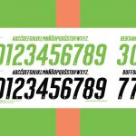
Since there is virtually no explicit reference to the Lev Tanju skateboard brand, the Italic style is a reference to the Palace logo, in which the brand name is inserted in Helvetica Neue Condensed Oblique. Another peculiarity of this font is the fact that the numbers placed in the shorts have a black outline, not present in the jersey.
The Juventus x adidas x Palace collection also includes a black alternative, intended for the two orange and green goalkeeper kits, in which the bright color of the fourth kit would take away the visibility of the players' numbers and names.