The AC Milan's rebranding
The Rossoneri unveiled a new visual identity, inspired by the glorious past and focused on future
Sports
September 19th, 2019
September 19th, 2019
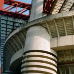
It's the Milan Fashion Week time but above all the eve of the first Milan derby of the season, which the Rossoneri will play 'at home' trying to stop their cousins, at the top of the league after three gamedays. For the occasion, the Devil club will present itself with a new look, which concerns not only the style of communication of its brand in everyday life, but also and above all the places so attached to the supporters as S. Siro stadium and the social channels frequented by millions of fans from all over the world. A rebranding that goes beyond football and borders and that is part of the restyling process wanted by the new board and that has been entrusted to the well-known London creative agency DixonBaxi, which has renewed the visual identity of the Milanese team.
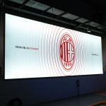
From players to fans, from Milan to the World: these are our colours, this is our badge #SempreMilan
— AC Milan (@acmilan) September 16, 2019
Dai giocatori, ai tifosi. Da Milano, al mondo intero. Questi sono i nostri colori, questo è il nostro stemma #SempreMilan pic.twitter.com/Gjr6oQBDaz
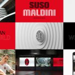
'Sempre Milan' campaign is inspired by the glorious Rossoneri past and enhances some traditional symbols such as the club's oval crest, the undisputed protagonist of the new digital interface along with some new mottos such as 'From Milan To Many' and 'We The Proud', strictly in English, that redefine language by mixing the concepts of passion and elegance. Another absolute novelty in the graphics is the font, inspired by the heartbeats shared by the fans and conceived as a future expressive terminal for the whole Rossoneri universe. The search for new potential fans to be involved in this innovative project is also dictated by the choice of introduce in the merchandising many new lifestyle products, such as skateboards, which can also embrace the taste of new generations.