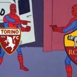
AS Roma and FC Turin have the same shirts' font
A strange coincidence on the Nike and Joma kits
September 2nd, 2019
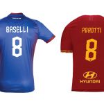
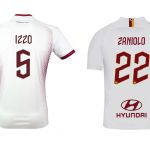
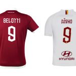
Unlike other championships such as the Premier League, LaLiga and Ligue1, in Serie A clubs are not obliged to use a standard font on their jerseys. Looking at the match between AS Rome and FC Turin you could still think the opposite. The reason is that the two fonts used by the sponsors Nike and Joma are the same, with different concepts but inexplicably too similar.
The Roman epigraph font used last season by the Giallorossi was replaced with the lightning font, inspired by mythology and the figure of Jupiter. If the repertoire of ideas proves to be limited, we must recognize to Rome and to Nike of having created one of the most original characters among Italian clubs, like the camo used by Juventus.
We have long accepted the fancy approach of AS Rome, that is reflected in the language of communication on social media (we talked about it here). The zig zag angular character of the 19/20 season is in line with the big lightning of the Away kit and the smaller ones on the Home kit's collar, something that is less consistent with the Torino shirt.
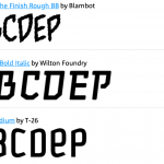
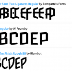
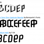
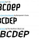
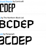
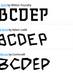
The font used by both clubs is original and on online font platforms, there is no similar base from which both the designers of Nike and those of the Spanish brand Joma could have casually started. However, there are many variations of characters built on the hexagonal shape and diagonal lines, which can represent the inspirational package for the two clubs.
The casual similarity is still the most unlikely solution, so is it likely that one of the two brands (in this case Nike) has designed the kits for the other? Or that the same graphic designer sold his project to the two clubs at the same time?


