Real Madrid and Inter Milan's jerseys are very similar
Aquamarine is a trend, or adidas has just a problem with creativity

Sports
July 30th, 2019
July 30th, 2019
It was certainly not a happy weekend for Real Madrid and all the Blancos fans, in the second ICC match the Atletico Madrid rivals wiped out Zidane's players with an inexplicable 7 to 3, which was followed by dispute by captain Sergio Ramos.
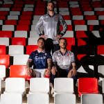
As if that weren't enough, yesterday Real presented its official Third Kit for the 2019/2020 season and immediately the feeling is of not being in front of an unforgettable jersey. It is certainly not the aquamarine, the color that characterizes the entire kit of the Spanish club, the biggest sin of adidas, which has accustomed us in these years to more bright and strange tones, from red to blue, up to orange and purple, also worn during the Champions League final win against Juve in 2017. What leaves us little amazed is the undeniable resemblance to the Away Inter Milan shirt, presented more than a month ago and made by Nike.
The details of the V-neck with a crossed border, the cuffs of the sleeves and above all the color tone - slightly darker than that of the Nerazzurri - leave no room for imagination and risk to confirming a worrying lack of initiative of the German brand for how much concerns big clubs projects.
Only Arsenal and Juventus, in fact, among the main clubs, presented kits that demonstrate a study that aspires to originality and a more brave search for a design. Many other clubs such as Manchester United and Bayern Munich have presented jerseys that recover the values of their tradition but without the touch of boldness that the major competitors like Nike and PUMA have put in the kits of FC Barcelona, Chelsea, Paris Saint- Germain or Manchester City, the latter in particular.


To raise even more suspicion that adidas is a real creative crisis is the question of goalkeeper jerseys. Some time ago we noticed how all the jerseys proposed for the next season used the same background pattern, removing the nuances of personality and the completely different soul of the different clubs. In official statements it seems then that they try to mask the problem, attributing acrobatic inspiration.
On the official website of Real Madrid in particular, we read how the new shirt takes inspiration "from the innovation and technology of the future, with the new Bernabeu stadium as the main reference". The arguments do not seem enough, as well as those for the Away shirt, which justified a totally anonymous background texture with a reference to the sound waves produced by the Bernabeu during the "La Decima" season.


However, it is important to keep in mind that Real Marid and adidas have certainly not designed the new shirt in the last month and a half so we can't talk about plagiarism or brazen inspiration towards Inter Milan. The projects for the new uniforms are decided at least with a season in advance and if we want to try to find the origin of this trend - at least from the chromatic point of view - the memory brings us back to the Third kit made by PUMA for Arsenal in the last season. A regret, however, remains that of not seeing more adidas at the same levels of creativity achieved in the 80s and 90s, particularly in that 1988 European Cup, which gave us unforgettable jerseys like that of Netherland, the USSR or Germany, which had made the Adi Dassler brand a pioneer for a new football style.