Is Sampdoria's new Away shirt the worst in Serie A?
The strange pattern chosen by UC Sampdoria and the sponsor Joma has not convinced us at all
Sports
July 22nd, 2019
July 22nd, 2019
A few days ago we celebrated UC Sampdoria's Home jersey for next season, which took up the historical color scheme, loved by many fans and collectors, enriching it with very interesting details like the polo collar and the skyline inserted inside the shirt numbers. We would not have expected that the Genoa club would have produced a great candidate in advance for the prize for the ugliest uniform of the 2019/2020 season.
The decision to continue on a classic and simple style enriched with details convinced us this summer as well and for this reason, the new Away kit has left us with that expression with which we are used to seeing Messi in memes on Instagram and Twitter.

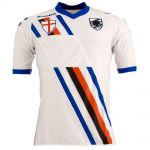
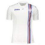
The iconic Sampdoria model will give way to a white jersey with red, blue and black shades. Finally, the blue details on the shoulders and collar do not honor the history of Samp uniforms.
Sampdoria fans as well, on the fan pages and the various social accounts are split in two parts: on the first hand the fundamentalists, on the other who appreciated the temptation to restore a new image of the club with a courageous idea.


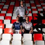
The launch campaign, in which Colley, Linetty, and the last signing Maroni were photographed in a forest along with pines and moss - Messi meme pt.2 - also issued the final ruling on the new shirt.
A pity gave how much Joma was doing in this pre-season, demonstrating that the Spanish brand knows how to make really interesting kits like those for FC Turin and Atalanta. The brand along with Macron is changing the perception of many clubs and fans, proposing with increasing conviction even outside the amateur and semi-professional championships, to which it is historically linked.
I didn't think it was possible to create an ugly Samp shirt but... pic.twitter.com/AE2jF1sVF6
— Phil Delves (@phildelves) 19 luglio 2019
In recent years the Away jersey made by previous sponsors (Joma, Kappa) has always gone towards the conservative direction, replacing Royal blue with white and modifying the position of the Sampdoria band only in some seasons. In the 2010/11 season, the symbol of the club was inserted diagonally, in 2016/2017 with a brush effect, while in the last championship a historical pattern was taken up with the band positioned vertically to the left. For the next season, the choice goes against the current and for the moment we will wait for only the Ferraris Stadium matches.