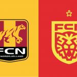
Nordsjælland unveiled the new crest
The Danish club has renewed its logo through a modern rebranding operation
Sports
June 26th, 2019
June 26th, 2019
Some of you maybe remember they for having participated in the 2012/2013 Champions League edition, in the same group with Juventus, which in Denmark will not go beyond a modest 1-1: we are talking about Nordsjaelland, one of the many teams in Copenhagen that after the European exploit has a bit disappeared from the radar since winning the first and only Danish title. Simultaneously with the presentation of the new Nike jerseys (instead of Diadora), the club founded 'only' in 1991 also revealed the new logo, which will appear on the game shirts starting from next season.
Respect the history. Define the future. pic.twitter.com/gCd9ijkx8m
— FC Nordsjælland (@FCNordsjaelland) 25 giugno 2019
CEO Søren Kristensen himself explained the reasons of this revolution, through a video that appeared on the Danish team's website: the new graphic identity reflects a clear desire of the club to assume greater relevance not only locally, but above all internationally. A necessary operation even if risky, like all visual revolutions. The research work and the design of the new visual identity of the club were carried out by the international agency Pupila, which anonymously spoke with many fans and employees of the club to discover the desires and characteristics (internal and external of the club) to which they could be inspired before to start work.
BOLD CLUB. BOLD CHANGE. pic.twitter.com/Ysgq6BTedZ
— FC Nordsjælland (@FCNordsjaelland) 25 giugno 2019
The symbol is the wild tiger, but in a stylized mode: in the video illustrating the operation, Kristensen also mentions Juventus and Liverpool as positive examples of a successful revolution. Among the features of the new logo is the visual flexibility: the crest will be able to appear in different contexts and on different sweaters in different colors depending on what a rival or a fan wants.