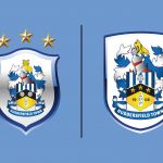
The Huddersfield Town's new logo
Just an evolution compared to the old crest of the English club
Sports
June 10th, 2019
June 10th, 2019
After Guingamp, another newly relegated club has decided to change its logo: we are talking about a team that has just left the Premier League after two seasons, Huddersfield Town. More than a large rebranding operation, the one operated by the Terriers was defined an evolution, an adaptation to the old crest that accompanied the historic English team in its centenary history, aiming at a more modern line, without forgetting the past and its traditional elements.
There are five changes made to the crest
— Huddersfield Town (@htafcdotcom) 7 giugno 2019
- The Thrice Champions stars placed centrally
- Added '1908' to commemorate #htafc's formation
- Focus on one Yorkshire White Rose
- An update of the Terrier
- Change to the shield
Full details https://t.co/UHPnVmyrsC
(CL) pic.twitter.com/NJoFwW8e5L
The twists compared to the old version decided by President Dean Hoyle are five, as showed in the video released by the same club: the shape, less rounded than the previous one (even if the logo will be used even without the external shield); the three stars, added in 2000 to remember the three titles won in the 1920s, shown inside the badge; the addition of the number 1908, relating to the club's foundation year, separated from the stylized image of Castle Hill; the Terrier, the dog symbol of the club also inserted in the crest proudly sitting at the top of the shield; the White Rose instead of the Two Roses, one of the historic elements of the Yorkshire roots located at the center of the crest, among the typical white and blue stripes, like the social colors of the club.