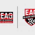
En Avant de Guingamp unveils a new logo
The small French team has just changed its crest and technical supplier in the same day
Sports
June 7th, 2019
June 7th, 2019
After the recent relegation in Ligue2, it's time for a small revolution for the small team of Brittany: Les rouges et noirs. They have in fact just unveiled the new crest, modifying the current rectangular logo used over the last 20 years to one with a more traditional shape, designed by a local designer. The elements, however, have not disappeared at all, continuing to reflect the identity and soul of the team founded back in 1912: there are the traditional colours, red and black; the inscription EAG, the acronym of En Avant de Guingamp; the club's founding date, 1912; and the Trickle (or the Triskelion), the ancient Celtic symbol that has always been one of the emblems of the Breton territory.
Fiers de nos couleurs. En Avant Guingamp !
— En Avant Guingamp (@EAGuingamp) 6 giugno 2019
https://t.co/7h72AqN1Zv pic.twitter.com/CiG1UqDUPw
The rebranding operation arrives at the right time, a transition period between the past and the future of the twice-winning French Cup team that has always made the vanguard its philosophy, as the words 'En Avant' say. The new logo, the sixth in the history of the club, will soon appear on the next season's game shirts to be made by Umbro, who just in the past few hours has signed with Guingamp to replace the old technical supplier, Patrick.