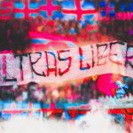
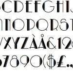
Ultras Liberi: the stands font
The fight with the police and the graffiti, passing through SS Lazio and LIBERATO
Sports
July 1st, 2019
July 1st, 2019
The Ultras Liberi font has a certain familiarity more or less in everyone memory. Even if you do not attend the stadium stands by preparing banners against the police, surely you will have seen it on some wall in your city.
That of Ultras Liberi, or Fasciofont as it is known by many, is not only a graphic story, but as suggested by the name, a detail of the narration of a precise Italian historical era, which favored the survival of extremist subcultures and ideologies, all now widely diffused in the stadiums.
From the student demonstrations, this character has found its stage in the stands, in which the messages launched sound like splits and categorical accusations, to which graphically a square or bold must be associated. The same effect could not be elicited by a graceful or italic font. Even us, writing in chats and wanting to highlight a concept, we use Caps Lock, just because reading is not just a mechanical practice, but above all a graphic, photographic and perceptive fact.
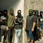
Rather physiologically that it was the stadiums that collected the legacy of Fasciofont, since they - with due proportions - were the last outpost of militant and by nature aggressive groups born during the Fascist period in Italy. Many fans have recovered the typical symbols and choruses of those years, linking more and more the relationship between the ideas of the right and the organized support. According to what emerges from the report of the National Observatory on Sport Manifestations (Onms), among the 328 active groups, 151 are politically oriented: 40 from the extreme right, 45 from the right, 33 from the left and 21 from the radical left. The right-wing fans, however, are groups determined, at least politically, more than the left-wing supporters, thanks to online communication, slogans, and meetings on current issues. But for politicized it means not only the display of a banner or the singing of some choir. In some lands, football and politics are intertwined, the heads are bent and the throwers tighten ties or are part of the ranks of parties and criminal movements.
In addition to Lazio, other fans more or less openly lined up on the right are those of Hellas Verona, Drughi Juventini, the Irriducibili of Inter Milan, AS Roma's Boys and Youth groups and even the Ultras of AC Milan, for the past 25 years since left-wing ideas to others more in line with recent corporate history.
An article written by Valerio Mattioli on Vice, Ultras Liberi is described how
"font with a geometric layout, those fonts that are the morphology of the letter modified by geometric, modular shapes. Other examples of the same family are the Avantgarde and the Futura (Supreme's to be clear)".
Although the name can easily make you think otherwise, the story of this character does not start on the curve at the San Siro, at the Olimpico in Rome or at the Allianz Stadium, and does not even have an origin linked to a leading art. If in fact the Helvetica font - that of the Jeep logo, The North Face, Nestlè and Microsoft - comes from the great Swiss printing school, a descendant of the geometric rigor of the Bauhaus, Ultras Liberi has a more popular origin. Crossing some variations in the figures and form, this font has kept its popular aspect, in some ways still calligraphic, linked to the gesture and to the set of values of which it is the medium since its origins.

The name was officially registered on the main font platforms in 2008, by The Maccio, the character was known as Fasciofont. Its roots, in fact, refer to the fascist and neo-fascist journalism, as despicable as it is florid and original from the creative point of view.
Ultras Liberi has some differences with respect to Fasciofont, less proportionate and bolder, but still tied to a fringe of the extreme right spread also in France under the name of Ordre Nouveau. It was born just beyond the Alps and from the militant youth movement Ordre Nouveau, in which Jack Marchal, inventor of Black Rat, Mickey Mouse's neo-fascist alter ego collaborated for the graphic communication.
The inspiration also refers to the psychedelic fonts typical of the '60s disco nights, and from there it evolved into many variations. The musical cultures of those years broke away from social conformism also through a more libertine approach towards altering substances such as LSD, evidenced by songs like Lucy In the Sky With Diamonds or by cult films like Dannis Hopper's Easy Rider. The world distorted by hallucinations has created artistic currents and pictorial techniques such as that of the Tie Dye, also influencing typography, altering and distorting the proportions of some fonts. From propaganda tools, they became characters of a new youthful attitude, which resumed independence with respect to previous generations that had led, as in the case of the United States, to conflicts such as the Vietnam War.
Stylistically Ultras Liberi could derive from characters born long before the 1960s, and in particular from the refined ones of Art Deco, conceived with the purely decorative purpose inspired by the complexity of natural and spontaneous forms.


È il Ratanegra di Marchal la base dal quale sono partiti i vari tipografi per reinterpretare il font, che ha continuato per molto tempo la sua vita come firma su manifesti e riviste di stampo neo-fascio-satirico.
Finito il periodo delle occupazioni studentesche consapevoli e dei sesantottini, Fasciofont ha perso via via il suo carattere politico, venendo utilizzato anche per manifestazioni comuniste o in Curve notoriamente schierate a sinistra, persino in contesti apolitici.
In questo momento storico in cui le tensioni politiche sono più rilassate, il font è ripreso e rielaborato rispetto alla tradizionale visione.
Una delle più riuscite riproposizioni negli ultimi anni è legata alla comunicazione e all'immagine di LIBERATO, che lo ha utilizzato per il suo merchandising e in quel famoso frame con il mare e il murales "L'anonimato" che descrive i tratti di un'identità sfuggevole. Il mistero che circonda Liberato ha caricato Ultras Liberi di nuovi significati, legati alla fenomenologia dell'artista, al rapporto con il paesaggio della città di Napoli e alla passione per la squadra azzurra, mai nascosta in molti dei video diretti da Francesco Lettieri.


We do not know the exact moment when the font was used by Italian ultras groups, but the origins of organized support once again arise from right-wing political thought, the first in fact were the SS Lazio's fans who created the "Paranza Aquilotti" in 1932 ", an organized and hierarchical association. Note similarity between the font of stadium banners and that used on monuments of the Mussolini era can be considered the beginning of the historical birth of Ultras Liberi.
The first real groups in a modern sense were born at the end of the 1960s, the same as those of Ratanegra and Marchal, when political events and processions inspired the creativity of the stadiums. It was not long before the ultras became aware of the great potential of the stadiums in terms of visibility, they could, in fact, get direct messages, regulated by a leitmotiv in both tone and form, to a community of like-minded people. The supporters began to expose their ideas during the games and only many years later it came to prohibit the posting of writings with political references, which have not however abandoned the walls in the streets.
A 2010 sociolinguistic study conducted by Nicola Guerra, Valentina Imperi and Claudi Vardanega on the banners exhibited at the Artemio Franchi in Florence contributed to overturning the role and the sociological approach given by the previous studies on the intents of the ultras.
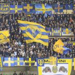
The Fiesole curve analysis has found much more communicative complexity than the stereotype largely promoted by the media. Banners are an incredibly effective and direct tool for sharing a complex identity, consolidated through the display of territorial signs, no longer generic and purely ideological, as happened in student processions. The Ultras phenomenon and thus the banners are not only a goliardic expression, a manifestation of discomfort or an aversion towards the institutions, but a continuous claim of one's identity, which finds its sounding board in the stadium. This theory would also be justified by flags, which as medieval banners mark the control and presence of a group in that specific territory.


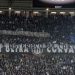


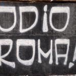
The Ultras world explains its presence through the voice and the written word, to attest to territoriality that is not by chance more marked in smaller stadiums, or in cities where there is a strong urban rivalry. For this reason, the most memorable banners of teasing in recent years have appeared in Rome, and less in Turin or Milan, in which rivalries between the supporters maintain rather quiet levels.