US Sassuolo Calcio: rebranding operation
The new "Sasòl" designed by Niccolò Baldi and nss sports
Sports
April 12th, 2019
April 12th, 2019
Disclaimer: this project was not carried out in collaboration with the U.S. Sassuolo Calcio but is the result of nss sports imagination.
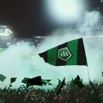
The US Sassuolo Calcio season can simply be divided into two great moments, which coincide with the first and second round, in which the path and ambitions of De Zerbi's team have been decidedly reduced. A "before Boateng", which made the fans and lovers of romantic football hope to see again a provincial club in Europe, and an "after Boateng", in which the limits of a talented team emerged, unable to react in the moments of pressure.
One of the strategies to relaunch the Neroverde project next season could be to renew its graphics and corporate identity with a rebranding operation. The restyling would help strengthen its history and above all abandon a crest too similar in shape to that of FC Barcelona.
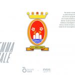
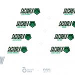
For the fifth chapter of "Operation Rebranding", Niccolò Baldi has recovered the shapes, colors and symbolism of the Emilian city, a source of inspiration for a new logo and three different kits.
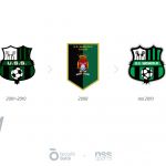
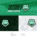
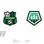
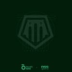
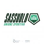
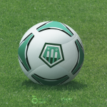
The current crest has been in use since 2010, mainly in black and green, and divided into 4 sections, inside which is inserted the ball, the “U.S. Sassuolo” inscription and the 3 mountains, the symbol also of the city's emblem. All these elements have been stylized and repositioned within a regular pentagon shape, similar to that used by Watford and Lille. The concept excludes the writing from the composition, making the new crest graphically more immediate, also exploiting the symmetry of the composition. The geometric rigor is, in fact, the basis of Niccolò Baldi's work, as can be seen from the geometric tables.
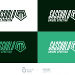
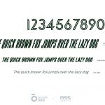
In addition to the crest, a logotype has also been devised, which also uses the new and customized “High” font, narrow, elongated vertically and slightly tilted to the right with the same angle as the sides of the Pentagon, so that it integrates harmoniously with it. The new proposal adds movement, vivacity, and dynamism to the textual identity, used to name all areas of the club.
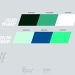
The project also intervened on the palettes and the colors were modified and coded to promote more readability and visual impact on TV and smartphone screens, avoiding the phenomenon of common chromatic flattening in many soccer uniforms. For this reason, the green color was made brighter, while the black was cooled by tone.
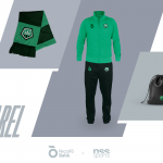
As for the uniforms, "rebranding operation" has decided to change the typical Home-Away-Third scheme, drawing instead on what Nike did for the NBA franchises, making 3 kits each with a different purpose.
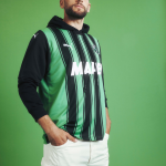
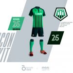
The ICON KIT wants to be the distinctive one of the team, similar to the traditional model. The concept is characterized by 5 black bands, the same of those that support the 3 mountains in the crest. Are adopted two different variations of green, a lighter one for the bust and a darker one for the collar, sleeves, and shorts.
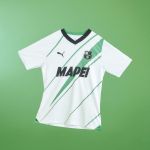
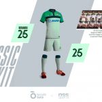
The CLASSIC KIT is inspired by the uniform of the 88/89 season, the first in which the sponsor Mapei appear on the chest of the Sasòl jerseys. Also, in this case, the colors are green variations, with the prevalence of the lighter tone.
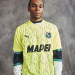
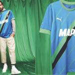
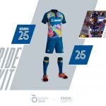
The PRIDE KIT is certainly the most unusual project among those proposed. To inspire the uniform is the shirt used by the Mapei cycling team, which brought Italian cycling to the top of the world. The reference to the sponsor is strong because the history of Sassuolo does not offer many connections at high levels, almost everything is tied to the property, according to a model that seems to be disappearing, and for this reason, we wanted to strengthen it inside the game uniforms.


Disclaimer: this project was not carried out in collaboration with the U.S. Sassuolo Calcio but is the result of nss sports imagination.