ChievoVerona: operation rebranding
The Scaliger dynasty and the pride of a neighbourhood comes to the new nss sports graphic project
Sports
April 8th, 2019
April 8th, 2019
Disclaimer: this project was not carried out in collaboration with the Torino Football Club but is the result only of the nss sports imagination.
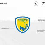
It's Luigi Cascella who carries out the new Operation Rebranding project, the nss format that has reached its fourth Italian football team. "Victim" of the project that proposes possible graphic restyling of the Serie A teams is AC ChievoVerona. Relegated to the last place in the standings and almost certainly destined for the Serie B, Pellissier and teammates will surely have to restart with a new plan next season, canceling all the good that was done in the 18 consecutive years in Serie A. One way to doing so could be to modernize its aesthetic image, its logo design and the social communication.
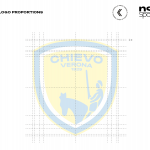
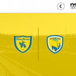
The goal of the project is precisely to renew an old crest, putting the word Chievo in the foreground, to witness the club's attachment to a specific neighborhood in Verona. Among the changes, there is also that of the shape of the Swiss shield, which flattens the two recesses, placed side by side on the top, with a cleaner and more modern line.
As with the new Turin FC logo, the colors have remained unchanged, except for a white line that runs along the perimeter of the shield. The elements inside the crest were instead enlarged, to highlight and make them protagonists of the composition.
Among these is the Cangrande I della Scala, the knight who lived in the first half of the 1300s, one of the most loved of the Scaliger dynasty, the family that reigned in Verona for 125 years and whose coat of arms is also part of the symbolism of the rival citizens of Hellas.
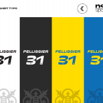
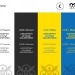
The medieval character Fraktur is one of the main causes of the lack of incisiveness of the logo, too old and not very suitable for a football team. For this reason, Luigi Cascella has chosen to replace it with a lighter and more clear font like the Adieu.
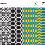
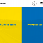
The proposed patterns, both in yellow-blue - Pantoni 012C and 3005 C - and in white-black, recover the Scaligerian symbology, with the repetition of the effigy.
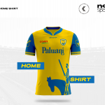
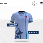
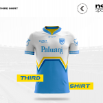
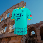
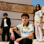
For the possible Givova kit for the 2019/2020 season, the project takes its inspiration from some links of the past of the Clivense club. The Home uniform introduces a design with blue sleeves, in contrast with the yellow of the front of the tee, finished on the edges with a decorative band inspired by the symbols of the city. The Away kit is instead a mash-up of the one adopted in the 2014/2014 season and the "baby blue" used in the 2002/2003 season, the one after the surprising fifth place in the Serie A debut season, that of Bierhoff, Perrotta, Corini, and Eriberto.
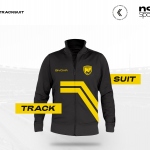
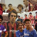
Confirming the great possibilities not exploited by the Verona team, the project thinks of re-using some logos of the past within the merchandising. The mock-up of the tracksuit with the 1991 graphic is an example, which also shows the strength of the contrasting yellow with neutral colors like black.
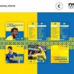
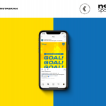
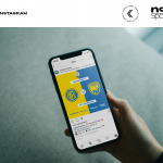
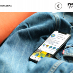
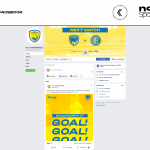
Finally, the rebranding also includes a renewed social identity, both for the Facebook profile (128 thousand "like"), and for the Instagram one (95 thousand followers).