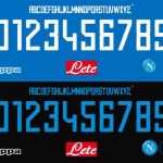
SSC Napoli 2018/2019 font
During the season just started the Italian side is using a completely different font
September 19th, 2018
That of analyzing the football fonts is one of our obsessions, and so we could not exempt ourselves from the focus on what will be used by SSC Napoli for the 2018/2019 season. The club of President De Laurentiis, who as you already know is wearing questionable Kappa's kits which are just discussed for their exuberance, has chosen to adopt a rather edgy font, completely different from the sweeter and more rounded one that had been applied during the past seasons.
And then, after the first seasonal matches of the South-Italian club (and the debut of the European jersey in which there are yellow details), it's time to comment on the optical effect that produces on the jerseys during the games. What do you remember? At first look, it can be compared to the font used by adidas during the last World Cup, which many problems had created: take a look at the letter B and at number 8 to realize how misunderstood it can be.


