Lille OSC unveils new logo, again
Any thoughts?
Sports
June 20th, 2018
June 20th, 2018
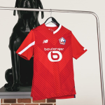
LOSC Lille's last season was bad enough, ended only with the 17th place in the standings and with the relegation's fear present until the end of the season. Bielsa has left and for the next year there are a lot of doubts of a regular entry: in the meantime, the board has presented the new crest, the third in the last seven years, which will appear on the shirts produced by New Balance.
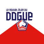

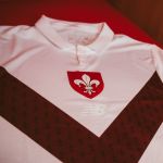
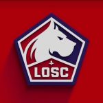
After a quick glance, it would not look like the badge of a football team, because it's pentagonal. Inside there are at least five strong references to the symbols and the tradition of the club of the north of France: in the foreground there is the 'dogue', that is the great Danes, which appears continuously since 1981; below then the word Lille disappears and only the abbreviation LOSC (Lille Olympique Sporting Club) remains, while above it appears another symbol of the club, the 'Fleur de Lys', the lily. The colors are always the same: red, white and blue navy as a result of the fusion of 1944. On the left of the figure, the presence of a flame is imperceptible, indicating the passion of its supporters. Finally, let's go back to the shape of the shield, inspired by the form of one of the most important local monuments, the 'Citadel de Lille', designed by Vauban in the 17th century.
Notre Dogue est là. Fort, Fier, Conquérant et Passionné.
— LOSC (@losclive) 19 giugno 2018
Nouvel élan, nouveau logo.#FollowTheDogue
https://t.co/Dl8Z6v0RVC pic.twitter.com/BtvW3cXw1F
The campaign has been supported by the hashtag #followthedogue (which has replaced the old slogan, #LOSCUnlimited) and is 'splitting' the fan, since it was difficult to imagine that everyone gave a good response about it: the most frequent criticism? Which reminds the Caen's logo, which resembles that of a hockey team, which seems that of an animal rights association or that the company could otherwise use the money, for example by reinforcing the team.