
The bizarre Real Madrid 2018-19 font
Ridiculous or classy?
Sports
May 30th, 2018
May 30th, 2018
Tuesday morning Real Madrid and adidas football unveiled the new kits for the 2018-19 season. Along with the new designs - very simple and elegant - the Blancos presented the new customized 2018-2019 font which will be used by the Blancos for the Champions League and Copa del Rey games, given that in Liga has been adopted the unified font for all teams.
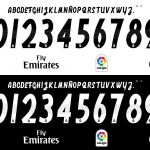
The typeface lettering uses a quite original and bizarre style: it's ornate and some letters are italic, which could result little bit confusing (especially for the E and the Z). The numbers are in proper italic, on the inside there are small holes. On the bottom of Real Madrid's 2018-19 kit numbers is a monochromatic version of the club crest.


Twitter did not react well: many users criticized the new design. On the other hand, the original typeface is in line with Real Madrid's legacy of strange and curious jersey fonts: from the galacticos era, Real has always been using peculiar typefaces that has divided supporters opinions.