Nike's 2018 World Cup fonts
Typography lovers this is for you
May 10th, 2018
Among the lovers of design and sports fashion, there is a niche that shares love and madness towards one of the secondary details of football shirts: the fonts. After years of disappointing, boring and banal fonts, the big brands - especially adidas and Nike - have rediscovered the pleasure for creative typography and we will appreciate the results this summer during the World Cup in Russia. The British designer Craig Ward explained in an interview how difficult it is to design a football font for FIFA competitions: there are a myriad of rules and guidelines drawn up by FIFA which must be followed to ensure visibility for the stadium fans, for the referee and for the televisions (here you can read the full document, it's more than 100 pages).
However - as for the donuts - not all fonts come with the hole: adidas has been heavily criticised for the square font that will be on all the uniforms designed by the three stripes in Russia. Instead, Nike has taken a different path using a standardized base for his teams with variations for each national team: here are all the fonts used by Nike for the 2018 World Cup.
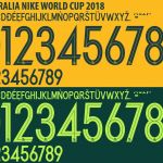
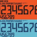
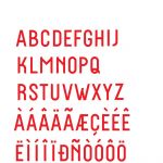
The Basic Font
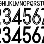
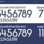
The basic font chose by Nike for the 2018 World Cup is really clear and compact. The font is gonna be used by Arabia Saudita, Australia, Corea del Sud, Croazia and Polonia.
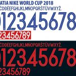
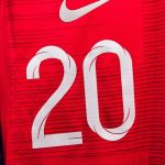
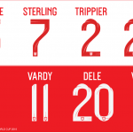
England
The design project for the English jersey's font was assigned to the designer Craig Ward, who told in an interview the experience and the emotion of working for the national football team of his country. The result is - in my opinion - the most beautiful font for the next World Cup: it has the most original design compared to the basic font above. The font's base is three classic English fonts and with the addition of a contemporary touch inspired by the Saint George's cross: he applied a 3D model to the base of the font, with the cross curving along the length of the font creating a very special effect.
France
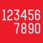
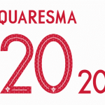
The peculiarity of the French font lies in the design hidden into numbers: they are cut in half by a line that culminates in the FFF logo (Fédération Française de Football) and contain within them a hexagons texture in a light blue. The geometric figure is a division of the geographical boundaries of France.
Portugal
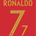
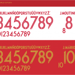
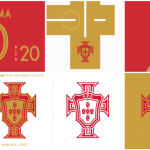
Portugal's font very similar to the French one, lines are a little bit sharper and the numbers embody a different graphic: a straight line cuts the numbers inside which contain a stylized version of The Military Order of Christ's cross, a Lusitan national symbol. The golden colorway in the home uniform is a tribute to the victory of Euro 2016, while in the travel shirt.
Nigeria
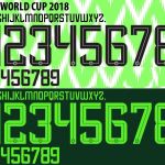
Nigeria's font fits perfectly on the stunning shirt that the Swoosh designed for the World Cup. It is a little variation on the basic font.
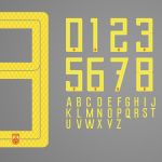
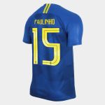
Brazil
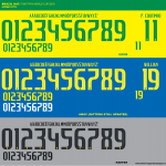
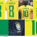
For the yellow shirt at home, the font will be green, with a zigzagged pattern inside and a yellow stripe to divide into two numbers and letters. For the blue away shirt, however, the font will be yellow and will resume the pattern inspired by the shape of a shirt star.
Fonts that we won't see in Russia 2018: Chile, USA, China and Holland
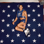
A real pity, three different fonts with the same theme of filling the numbers with mini graphics: a beehive pattern for China, the five-point star from the National Flag mixed with the eight-point star from the Mapuche war flag for La Roja and obviously the stars for the United States.


